
LEARN · EXPLORATORY DATA ANALYSIS & STATISTICS
A histogram looks roughly bell-shaped. The sample mean and median are close. The skewness is small. Your statistical software reports a p-value of 0.0001.
So, is the data normally distributed or not?
This is one of the most common—and most misunderstood—questions in statistical analysis. Normality testing seems straightforward: create a plot, run a statistical test, and decide whether the distribution is normal. In practice, that approach can produce misleading conclusions, especially when working with large datasets.
A statistically significant departure from normality does not automatically mean that your analysis is invalid. And failing to reject normality does not prove that your data follows a Gaussian distribution.
The real questions are more useful:
-
How does the observed distribution differ from a normal distribution?
-
Are the deviations concentrated in the tails, or do they affect the entire distribution?
-
Does the statistical method actually require normality?
-
Are we examining raw observations, regression residuals, or sampling errors?
-
Is the departure large enough to affect the conclusions we care about?
In this tutorial, we’ll answer these questions using Python, SciPy, statsmodels, Matplotlib, and a real household expenditure dataset.
We’ll build normal Q-Q plots, run the Shapiro–Wilk and Anderson–Darling tests, interpret their results, investigate the large-sample p-value trap, and establish a practical decision-making workflow.
1. What does normality actually mean?
A normal distribution is a continuous probability distribution characterized by two parameters:
-
Mean (μ): Determines the center of the distribution.
-
Standard deviation (σ): Determines its spread.
Its familiar bell shape is symmetric around the mean. The mean, median, and mode coincide, and observations become progressively less likely as their distance from the center increases.
openstax.orgFor a normal distribution:
-
Approximately 68% of observations fall within one standard deviation of the mean.
-
Approximately 95% fall within two standard deviations.
-
Approximately 99.7% fall within three standard deviations.
These are useful reference proportions, not rules that every real dataset should satisfy.
Normality is about a distribution, not a variable’s name
Consider a retail dataset with these columns:
| Variable | Plausible shape | Why |
|---|---|---|
| Order value | Right-skewed | A few unusually expensive orders |
| Number of items | Discrete and skewed | Most baskets contain relatively few items |
| Shipping delay | Asymmetric | Delays can have a long positive tail |
| Measurement noise | Approximately symmetric | Many small disturbances combine |
| Monthly revenue | Possibly multimodal | Different customer segments or seasonal patterns |
Not every numeric variable should resemble a bell curve.
Order counts cannot be exactly normally distributed because they take nonnegative integer values. Transaction values are often skewed because very large purchases are possible while negative purchases generally are not.
Trying to force every numeric column into a normal distribution is therefore a mistake.
Three different normality questions
We should distinguish between:
- Normality of raw data
Do individual observations follow a normal distribution?
For example, are individual order values normally distributed?
- Normality of model errors
Does the random error around a model’s conditional mean follow a normal distribution?
For example, after accounting for household income, are unexplained differences in food expenditure approximately normal?
- Normality of an estimator’s sampling distribution
If we repeatedly collected samples and computed their means, would those sample means follow an approximately normal distribution?
This third question connects to the central limit theorem. Even when the underlying observations are nonnormal, their sample mean may have an approximately normal sampling distribution under suitable conditions.
These are three different questions, and answering one does not automatically answer the others.
2. Set up a reproducible Python environment
We’ll use the following libraries:
| Library | Purpose |
|---|---|
| NumPy | Numerical operations and synthetic experiments |
| pandas | Loading and manipulating tabular data |
| SciPy | Shapiro–Wilk and Anderson–Darling tests |
| statsmodels | Regression modeling and Q-Q plots |
| Matplotlib | Visualization |
Use Python 3.12 or newer and install recent compatible package versions.
Create a virtual environment:
python -m venv .venv
Activate it on Linux or macOS:
source .venv/bin/activate
On Windows PowerShell:
.venv\Scripts\Activate.ps1
Install the dependencies:
python -m pip install --upgrade pip
python -m pip install "scipy>=1.17" numpy pandas "statsmodels>=0.14.6" matplotlib
The SciPy version matters here. Starting with SciPy 1.17, the Anderson–Darling API supports an explicit p-value calculation method. Using it avoids relying on legacy result attributes scheduled for removal in SciPy 1.19.
Check your installed versions:
from importlib.metadata import version

for package in ["numpy", "pandas", "scipy", "statsmodels", "matplotlib"]:
    print(f"{package}: {version(package)}")
All examples below use a fixed random seed where randomness is involved, making the experiments reproducible.
3. Understanding Q-Q plots: the most useful visual diagnostic
A quantile–quantile plot, usually called a Q-Q plot, compares the distribution of observed values with a theoretical probability distribution.
For normality analysis, we compare our sample against a normal distribution.
Unlike a histogram, a Q-Q plot makes discrepancies between expected and observed quantiles relatively easy to identify.
How does a Q-Q plot work?
Imagine you have 100 observations.
The Q-Q plot:
-
Sorts the observations from smallest to largest.
-
Calculates their sample quantiles.
-
Determines corresponding theoretical quantiles from a normal distribution.
-
Plots the observed quantiles against the theoretical quantiles.
-
Adds a reference line to help visualize the differences.
If the sample follows a normal distribution, the points should lie approximately along a straight line.
Random deviations are expected, especially near the ends of the distribution.
How to recognize different Q-Q plot patterns
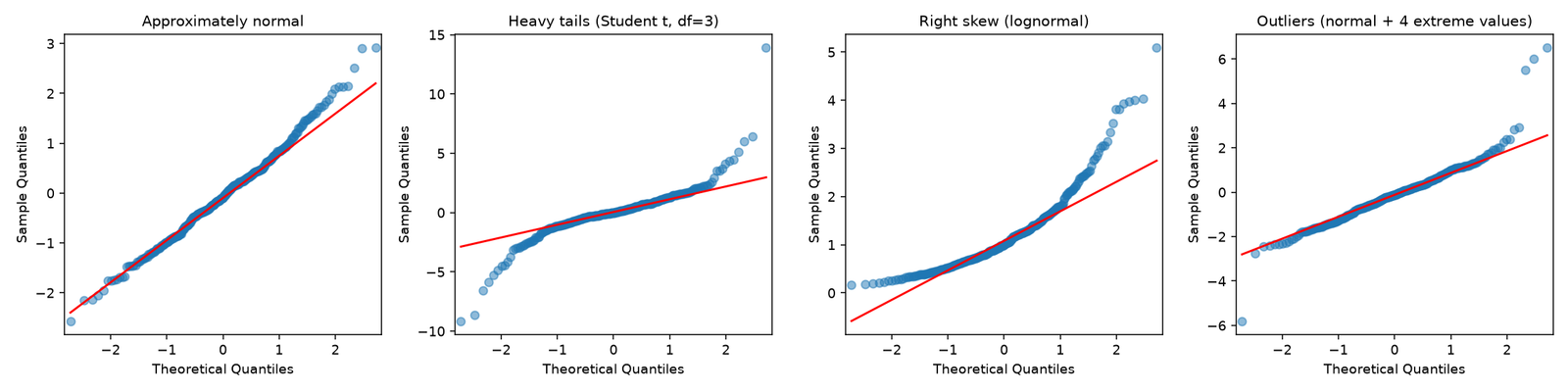
- Approximately normal: points follow a roughly straight line without systematic curvature.
- Heavy tails: left-tail points fall below the reference and right-tail points rise above it.
- Right skew: a systematic curved pattern, often with unusually large upper quantiles.
- Outliers: a small number of observations are far away from the overall pattern.
The panels above are simulated (300 points each, seed 42) to show the typical shapes. These are schematic patterns. The exact appearance depends on the scale and how the reference line is fitted.
Why the reference line matters
In statsmodels, the Q-Q plotting function supports several reference-line options:
| Option | Meaning |
|---|---|
line="45" |
Draws a 45-degree line |
line="s" |
Draws a line based on the sample mean and standard deviation |
line="q" |
Draws a line through the sample quartiles |
line="r" |
Draws a fitted regression reference line |
For ordinary unstandardized observations, the 45-degree line can be misleading. A sample whose standard deviation is 100 should not be expected to lie on the identity line against standard-normal quantiles.
A quartile-based line is often useful because it anchors the plot to the middle of the distribution and makes unusual tails easier to spot.
We’ll use this approach in our example.
The available options are documented in the current statsmodels Q-Q plot reference.
4. Real-world example: household income and expenditure
Let’s move beyond synthetic examples.
We’ll use the Engel household expenditure dataset, which is included in statsmodels. It contains actual income and food expenditure measurements from 235 working-class households in Belgium.
The observations are historical, but the dataset is particularly useful here because it is real, compact, reproducible, and available without an external download.
Our goal is to investigate a practical statistical question:
After fitting a linear model that predicts food expenditure from household income, how closely do its residuals resemble a normal distribution?
A residual is the observed value minus the model’s prediction:
Residual = Observed value − Predicted value
Residual diagnostics are more relevant here than insisting that household income or food expenditure must themselves be normally distributed.
Build the complete diagnostic script
Create a file named normality_lab.py and add the following code.
from pathlib import Path

import numpy as np
import matplotlib.pyplot as plt
import statsmodels.api as sm

from scipy import stats
from statsmodels.graphics.gofplots import qqplot


# Create an output directory.
output_dir = Path("outputs")
output_dir.mkdir(parents=True, exist_ok=True)

# Load a real dataset bundled with statsmodels.
df = (
    sm.datasets.engel.load_pandas()
    .data[["income", "foodexp"]]
    .dropna()
)

# Fit a linear regression model.
X = sm.add_constant(df[["income"]])
model = sm.OLS(df["foodexp"], X).fit()

# Extract fitted values and residuals.
fitted = model.fittedvalues.to_numpy()
residuals = model.resid.to_numpy()

# Shapiro-Wilk normality test.
shapiro_result = stats.shapiro(residuals)

# Anderson-Darling normality test.
anderson_result = stats.anderson(
    residuals,
    dist="norm",
    method="interpolate",
)

print(f"Observations: {len(residuals)}")
print(
    f"Shapiro-Wilk: W={shapiro_result.statistic:.4f}, "
    f"p={shapiro_result.pvalue:.4g}"
)
print(
    f"Anderson-Darling: A2={anderson_result.statistic:.4f}, "
    f"p={anderson_result.pvalue:.4g}"
)

# Create a three-panel diagnostic figure.
fig, axes = plt.subplots(1, 3, figsize=(15, 4))

# Panel 1: observed data and regression line.
income = df["income"].to_numpy()
spending = df["foodexp"].to_numpy()
order = np.argsort(income)

axes[0].scatter(income, spending, alpha=0.65)
axes[0].plot(
    income[order],
    fitted[order],
    color="darkorange",
)
axes[0].set(
    title="Spending vs income",
    xlabel="Household income",
    ylabel="Food expenditure",
)

# Panel 2: residuals against predictions.
axes[1].scatter(fitted, residuals, alpha=0.65)
axes[1].axhline(
    0,
    color="black",
    linestyle="--",
    linewidth=1,
)
axes[1].set(
    title="Residuals vs fitted values",
    xlabel="Predicted food expenditure",
    ylabel="Residual",
)

# Panel 3: normal Q-Q plot.
qqplot(
    residuals,
    line="q",
    ax=axes[2],
    alpha=0.65,
)
axes[2].set_title("Normal Q-Q: residuals")

fig.tight_layout()
fig.savefig(
    output_dir / "normality_diagnostics.png",
    dpi=160,
)
plt.show()
Run it:
python normality_lab.py
The script produces three complementary visualizations and prints both normality-test results.
Interpret the results
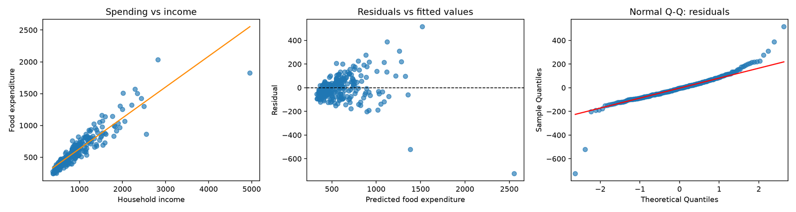
With the dataset and tested implementation, the results are approximately:
Observations: 235
Shapiro-Wilk: W=0.8808, p=1.258e-12
Anderson-Darling: A2=3.9006, p=0.01
The exact printed values may vary slightly between compatible software versions.
Both tests provide evidence against a normal distribution for the residuals under their reference assumptions.
However, we should examine what the three plots tell us.
Panel 1: Income versus expenditure
The scatter plot provides a direct view of the relationship we are trying to model.
It helps us identify potentially nonlinear relationships, unusual households, and whether the simple linear model is a reasonable description of the data.
Panel 2: Residuals versus fitted values
This plot investigates structure left unexplained by the model.
Look for:
-
Curvature, which may indicate an inadequately specified conditional mean.
-
Changing residual spread, which suggests heteroskedasticity.
-
Clusters, which may reflect missing variables or population subgroups.
-
Extreme residuals that deserve investigation.
A normality test cannot diagnose these problems on its own.
Panel 3: Normal Q-Q plot
This reveals where the residual distribution departs from Gaussian behavior.
For this dataset, the departures are sufficiently pronounced to warrant closer investigation rather than simply assuming normal errors.
Importantly, the Q-Q plot tells us about the shape of the discrepancy, while the numerical tests summarize evidence against the specified distribution.
An important qualification about regression residuals
Ordinary least-squares residuals are not identical to the unobserved model errors.
Even when the underlying errors are independent and normally distributed, the fitted residuals are generally correlated and can have different variances because of model leverage.
Consequently, applying an ordinary one-sample Shapiro–Wilk or Anderson–Darling test directly to fitted residuals is best treated as a diagnostic screening procedure, not an exact hypothesis test with guaranteed nominal p-value calibration.
For a rigorous formal assessment, the model-fitting process and its dependence structure need to be accounted for. A model-based simulation or bootstrap can be more appropriate.
This is a subtle distinction, but it matters when normality-test results are being used to justify formal statistical conclusions.
5. The Shapiro–Wilk test explained
The Shapiro–Wilk test is a widely used statistical test for assessing normality.
Its hypotheses are:
-
H₀: The observations come from a normal distribution.
-
H₁: The observations do not come from a normal distribution.
The test compares ordered observations with a pattern expected from a normal sample.
Its test statistic is called W.
Values closer to 1 generally indicate greater agreement with the normal distribution, but the W statistic does not have a universal acceptance threshold independent of sample size.
Understanding the p-value
Suppose the Shapiro–Wilk test returns:
W = 0.967
p = 0.023
Using a significance level of 0.05, this is evidence against the normality hypothesis.
That does not mean the probability that the data is normal is 2.3%.
The p-value describes how unusual the test statistic, or something more extreme, would be under the null hypothesis and the assumptions of the test.
The traditional rule is:
| Result | Statistical interpretation |
|---|---|
| p-value below 0.05 | Reject normality at the 5% significance level |
| p-value at least 0.05 | Do not reject normality at that level |
But this decision rule is not a measure of practical importance.
Sample-size and data-quality considerations
SciPy’s Shapiro–Wilk implementation requires at least three observations.
The documentation also notes that, for samples larger than 5,000 observations, the W statistic remains accurate but the calculated p-value may not be.
There are other important constraints:
-
The standard test assumes an appropriate independent sample.
-
Repeated values and heavily rounded measurements can affect interpretation.
-
Missing or infinite values should be addressed deliberately.
-
Severe dependence can invalidate the ordinary p-value calibration.
-
A nonsignificant result is not proof of normality.
For example, imagine 30 retail stores reporting rounded daily sales totals. The observations might contain many tied values, and nearby stores may share regional demand shocks.
Even if the Q-Q plot looks reasonable, the observations may not satisfy the independence assumptions needed for a conventional test.
Normality and independence are separate properties.
6. The Anderson–Darling test explained
The Anderson–Darling test is another goodness-of-fit test.
It compares the observed cumulative distribution with a theoretical distribution and puts relatively strong emphasis on discrepancies in the tails.
This makes it especially interesting when extreme observations matter.
For example, imagine analyzing server response latency.
The middle of the latency distribution might resemble a normal curve, while the upper tail contains disproportionately many slow requests.
That upper tail is often the part an engineering team cares about most.
A tail-sensitive diagnostic can help identify this discrepancy.
How the test statistic works
The Anderson–Darling statistic is conventionally called A².
Larger values indicate a greater discrepancy from the reference distribution.
Unlike W, the Anderson–Darling statistic is not bounded above by 1.
Its interpretation also depends on the specified reference distribution and how parameters are estimated.
Using the current SciPy API
For SciPy 1.17 and 1.18, provide a method explicitly when you want a p-value.
import numpy as np
from scipy import stats

rng = np.random.default_rng(123)
sample = rng.normal(loc=100, scale=15, size=200)

result = stats.anderson(
    sample,
    dist="norm",
    method="interpolate",
)

print("A2 statistic:", result.statistic)
print("p-value:", result.pvalue)
The literal option accepted by the current implementation is interpolate.
This is worth noting because some SciPy documentation text describes the method as "interpolated", while the implementation and its runnable examples use "interpolate".
Why is the interpolated p-value sometimes exactly 0.01?
The interpolation method uses tabulated significance thresholds.
For the normal distribution in SciPy 1.18, this effectively restricts the reported interpolation result to the tabulated range, from 0.01 to 0.15.
Therefore, a reported p-value of 0.01 can indicate a p-value at or below that lower boundary, rather than an exact probability of 0.01.
This explains the Anderson–Darling result in our household-expenditure example.
If you need a more informative p-value beyond those limits, SciPy also supports Monte Carlo estimation.
import numpy as np
from scipy import stats

rng = np.random.default_rng(2026)
sample = rng.standard_t(df=20, size=150)

method = stats.MonteCarloMethod(
    n_resamples=4999,
    rng=np.random.default_rng(123),
)

result = stats.anderson(
    sample,
    dist="norm",
    method=method,
)

print(f"A2 = {result.statistic:.4f}")
print(f"Monte Carlo p-value = {result.pvalue:.4f}")
Here, SciPy compares the observed statistic against a simulated reference distribution, accounting for the normal-distribution fitting procedure.
The finite number of simulations introduces Monte Carlo uncertainty, and the smallest resolvable p-value is constrained by the number of resamples.
This method is particularly useful when the usual interpolated p-value is at one of its boundaries.
It does not, by itself, solve dependence or regression-residual calibration problems.
7. Shapiro–Wilk vs. Anderson–Darling: which should you use?
There is no universally superior normality test.
Different tests are sensitive to different aspects of a distribution.
| Feature | Shapiro–Wilk | Anderson–Darling |
|---|---|---|
| Main goal | Detect departures from normality | Detect departures from a specified distribution |
| Test statistic | W | A² |
| Interpretation of statistic | Closer to 1 generally indicates a better match | Larger values indicate greater discrepancy |
| Tail emphasis | Sensitive to many distributional departures | Explicitly emphasizes tail discrepancies |
| SciPy p-value | Directly provided | Requires an explicit method in SciPy 1.17–1.18 |
| Large samples | p-value accuracy caveat above 5,000 observations | Can detect increasingly subtle departures |
| Most useful role | General-purpose normality diagnostic | Distributional and tail-focused diagnostic |
For most practical analyses, a reasonable approach is to begin with a Q-Q plot and use one numerical test if a formal diagnostic is helpful.
Running many normality tests and selecting whichever p-value supports a preferred conclusion is not good statistical practice.
The tests are not independent pieces of evidence when calculated on the same observations, and multiple testing can create additional interpretation problems.
8. The cherry on the cake: why large datasets can fail normality tests almost every time
Here is the surprising result that changes how you should interpret normality tests.
A distribution can look remarkably close to normal, yet produce an extremely small normality-test p-value when the sample becomes large enough.
This is not necessarily a problem with the statistical test.
It is a consequence of what the test is designed to detect.
Statistical significance increases with sample size
Suppose your observations follow a Student’s t-distribution with 20 degrees of freedom.
This distribution is symmetric and quite similar to a normal distribution, but its tails are somewhat heavier.
It is not exactly normal.
With a sample of 150 observations, a test may have insufficient power to detect the difference.
With 4,000 observations, the same underlying difference becomes much easier to detect.
Let’s demonstrate.
Reproducible experiment
import numpy as np
import matplotlib.pyplot as plt

from scipy import stats
from statsmodels.graphics.gofplots import qqplot

rng = np.random.default_rng(2026)

# Both samples come from the same nonnormal distribution.
small_sample = rng.standard_t(df=20, size=150)
large_sample = rng.standard_t(df=20, size=4000)

fig, axes = plt.subplots(1, 2, figsize=(10, 4))

for ax, data in zip(
    axes,
    [small_sample, large_sample],
):
    sw = stats.shapiro(data)

    ad = stats.anderson(
        data,
        dist="norm",
        method="interpolate",
    )

    qqplot(
        data,
        line="q",
        ax=ax,
        alpha=0.5,
    )

    ax.set_title(
        f"n={len(data)}\n"
        f"Shapiro p={sw.pvalue:.4g}, "
        f"AD p={ad.pvalue:.4g}"
    )

    print(
        f"n={len(data)}: "
        f"W={sw.statistic:.4f}, "
        f"Shapiro p={sw.pvalue:.4g}, "
        f"AD p={ad.pvalue:.4g}"
    )

fig.tight_layout()
fig.savefig("sample_size_effect.png", dpi=160)
plt.show()
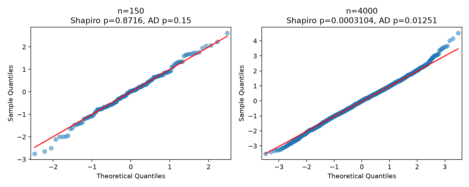
The seeded experiment gives approximately these results:
| Sample size | Shapiro W | Shapiro p-value | Anderson–Darling p-value |
|---|---|---|---|
| 150 | 0.9948 | 0.8716 | 0.15 (upper boundary) |
| 4,000 | 0.9983 | 0.00031 | 0.0125 |
Notice something remarkable.
The larger sample has a W statistic closer to 1, yet its p-value is dramatically smaller.
This is not contradictory.
The W statistic summarizes closeness to the normal pattern, while the p-value also reflects how much sampling variability would be expected at the given sample size.
At n = 4,000, the test has enough information to detect the subtle differences in tail behavior.
At n = 150, those differences are harder to distinguish from ordinary sample variation.
Does this mean normality tests are useless?
No.
It means the question being answered must be understood correctly.
A normality test asks whether the observations are consistent with an exact normal-distribution model under its assumptions.
It does not ask whether the departures are large enough to damage your business forecast, confidence interval, or decision.
As sample size increases, many tests become sensitive to progressively smaller fixed departures from the null model.
This does not mean that every genuinely normal sample will eventually be rejected. For a valid test under the true null hypothesis, the rejection probability remains approximately the selected significance level.
The problem is that real data rarely follows an idealized probability model exactly.
At large sample sizes, statistically detectable discrepancies can be practically negligible.
Why the Q-Q plot often matters more
The plot shows what the p-value cannot:
-
Whether departures are confined to a few extreme observations.
-
Whether the entire distribution is asymmetric.
-
Whether the tails are meaningfully heavier than expected.
-
Whether a systematic modeling problem might explain the discrepancy.
Even then, the plot should not be interpreted in isolation.
With very large samples, a dense Q-Q plot can hide details through overplotting. Tail quantiles and the consequences for the downstream analysis may still need closer examination.
The correct principle is not that plots always defeat tests.
It is that practical conclusions require examining the size and nature of deviations, not just whether they are statistically detectable.
9. When normality actually matters
Normality is relevant to some statistical procedures, but it is frequently misunderstood as a universal requirement.
Let’s examine the most important cases.
Case 1: Small-sample inference about a mean
For a classical one-sample t-test, exact finite-sample t-distribution theory assumes independent, normally distributed observations.
For normally distributed data, the theoretical calibration is available even for small samples.
For nonnormal data, the quality of the approximation depends on sample size, skewness, tail behavior, and other conditions.
With only 10 observations and severe skewness, the ordinary t-test may behave poorly.
With 2,000 independent observations from a distribution with finite variance and reasonably behaved tails, an approximate normal sampling distribution for the mean can be much more plausible.
The important question is whether the sampling distribution of the estimator is adequately approximated.
Case 2: Linear regression inference
Linear regression does not require the predictors or response variable to be normally distributed.
For example, household income can be heavily right-skewed without automatically invalidating ordinary least squares.
The classical normal-error assumption concerns errors conditional on the predictors.
Under a correctly specified linear model with exogeneity and appropriate regularity conditions, OLS coefficient estimation can remain valid without normal errors.
Normality matters more for exact small-sample inference and certain prediction-interval calculations.
It is not needed merely to compute least-squares coefficients.
Case 3: Prediction intervals
Suppose you’re predicting delivery time.
You might need an interval describing how long a future delivery could take.
If your method constructs prediction intervals from a Gaussian error model, the shape of the error distribution matters.
A heavier-than-normal upper tail could make a nominal 95% Gaussian prediction interval underestimate the probability of unusually slow deliveries.
In this situation, a tail discrepancy is practically important even if it affects relatively few observations.
Depending on the application, suitable alternatives may include empirical residual quantiles, quantile regression, or properly calibrated conformal prediction.
Each approach has its own assumptions and limitations.
Case 4: Process monitoring and anomaly detection
Some statistical process-control methods use normal-distribution assumptions to calculate monitoring thresholds.
If the monitored process has heavy tails, a Gaussian threshold can generate too many false alarms.
If the distribution is strongly skewed, symmetrical thresholds may provide an inaccurate picture of unusual behavior.
Here, distributional diagnostics can directly affect operational decisions.
For time-series telemetry, however, normality is only one consideration. Serial dependence, trends, seasonality, and changing variance must also be examined.
10. When normality does not matter nearly as much
Case 1: Tree-based machine learning
Decision trees, random forests, and gradient-boosted trees do not require normally distributed input features.
A retail feature such as customer lifetime spending may be highly skewed.
The model can still learn useful splits.
Transforming the feature might help with a particular problem, but passing a normality test is not a prerequisite.
Case 2: Descriptive statistics
You do not need normal data to calculate a mean, median, standard deviation, or percentile.
However, the choice of summary statistic matters.
For heavily skewed transaction amounts, the median and upper percentiles may communicate typical behavior and tail risk more clearly than the mean alone.
Case 3: Large-sample estimation
Many estimators have approximately normal sampling distributions under regularity conditions, even when the observed data is not normally distributed.
For example, the sample mean can be asymptotically normal under suitable independence and finite-variance assumptions.
But the central limit theorem is not a blanket guarantee.
It does not automatically fix strong dependence, infinite variance, highly influential observations, or an inappropriate estimator.
Case 4: Methods that explicitly model other distributions
Count models, survival models, generalized linear models, and many Bayesian models can use distributions other than the Gaussian.
A Poisson count model, for instance, does not require the counts themselves to be normally distributed.
The important requirement is that the chosen probability model and its conditional assumptions are appropriate.
Testing raw count values for normality would not establish whether a Poisson model is valid.
11. What should you do when a normality test fails?
A failed normality test is a prompt to investigate, not an instruction to transform everything.
The right response depends on the reason for the departure and on your analytical goal.
Option 1: Investigate the observations
Check whether the unusual values are:
-
Genuine but rare events.
-
Data entry mistakes.
-
Measurements with different units.
-
Duplicates or aggregation errors.
-
Observations from different populations.
Do not automatically delete points just because they lie far from the Q-Q reference line.
In a delivery-time dataset, an extreme value might represent a real transportation disruption.
Removing it could make a customer-facing prediction model unrealistically optimistic.
Option 2: Revisit the model specification
Suppose regression residuals show systematic curvature when plotted against predictions.
The problem may be a missing nonlinear relationship rather than the choice of error distribution.
Adding an appropriate nonlinear term, accounting for customer segments, or using a different functional form may improve the model.
Always inspect residuals against fitted values and relevant predictors before assuming that a transformation will solve the problem.
Option 3: Use robust standard errors when appropriate
When your main concern is regression inference and residual variance changes across observations, heteroskedasticity-robust standard errors may be useful.
Statsmodels supports the HC3 covariance estimator.
Using our household-expenditure example:
import statsmodels.api as sm

df = sm.datasets.engel.load_pandas().data[
    ["income", "foodexp"]
].dropna()

X = sm.add_constant(df[["income"]])

model = sm.OLS(df["foodexp"], X).fit(
    cov_type="HC3"
)

print(model.summary())
HC3 can improve standard-error estimation under heteroskedasticity, subject to appropriate assumptions and sample-size considerations.
It does not correct a misspecified conditional mean, dependence between observations, or the influence of severe data-quality problems.
Robust standard errors and robust regression are also not the same thing. The former changes uncertainty estimation; the latter generally changes how the model is fitted.
Option 4: Consider transformations
For strictly positive data with strong right skewness, a logarithmic transformation can sometimes be useful.
For example:
import numpy as np
import statsmodels.api as sm

df = sm.datasets.engel.load_pandas().data[
    ["income", "foodexp"]
].dropna()

positive = df[
    (df["income"] > 0) &
    (df["foodexp"] > 0)
].copy()

positive["log_income"] = np.log(positive["income"])
positive["log_foodexp"] = np.log(positive["foodexp"])

X = sm.add_constant(positive[["log_income"]])

model = sm.OLS(
    positive["log_foodexp"],
    X,
).fit()

print(model.summary())
This is a log–log model, which changes the relationship being estimated.
A transformation is not simply a cosmetic procedure that makes the normality test happier.
The transformed model answers a different statistical question, and predictions may require care when converting back to the original scale.
Also, logging a response does not guarantee normally distributed model errors.
The choice should be supported by domain knowledge, model diagnostics, and the intended interpretation.
Option 5: Choose an analysis suited to the data
Depending on the objective, alternatives include:
-
Welch’s t-test for comparisons of means with unequal variances, while checking whether its approximation is appropriate.
-
Quantile regression when conditional medians or other quantiles are the target.
-
Bootstrap uncertainty estimates that respect the sampling design and dependence structure.
-
Rank-based procedures when their estimands and assumptions fit the question.
-
Distribution-specific likelihood models when the data-generating process supports them.
A nonparametric method is not automatically assumption-free, and bootstrapping does not automatically rescue very small, heavily dependent, or pathological samples.
Always match the method to the scientific or business question.
12. Common normality-testing mistakes
Several recurring mistakes can make an otherwise careful analysis misleading.
Mistake 1: Testing every numeric feature before training a model
Normality is not a general prerequisite for machine learning.
Screening hundreds of input columns and transforming every nonnormal one can create unnecessary complexity.
First identify what your modeling method actually assumes.
Mistake 2: Believing that p greater than 0.05 proves normality
Failure to reject normality is not proof that the distribution is Gaussian.
A small sample may simply contain too little information to detect meaningful departures.
If approximate normality is important, examine the Q-Q plot and consider whether the plausible deviations would affect the analysis.
Mistake 3: Ignoring the sample size
A p-value should always be considered alongside sample size.
A tiny departure can become statistically significant in a large dataset, while a serious departure may go undetected in a small one.
Report the sample size with the test statistic and p-value.
Mistake 4: Testing raw data instead of model errors
In a regression setting, the response variable does not need to have a marginally normal distribution.
Testing the response alone does not establish whether conditional errors are normal.
Residual diagnostics are more relevant, while requiring care about their own dependence structure.
Mistake 5: Using transformations until a test stops rejecting
Repeatedly trying transformations and selecting the one that produces the largest p-value is a form of data-driven selection.
The final p-value no longer has the simple interpretation it would have had if the transformation had been chosen in advance.
A transformation should be justified by the model and the analytical objective, not by a desire to cross an arbitrary threshold.
13. A practical normality-checking workflow
For production analytics and applied statistical work, I recommend the following sequence.
Step 1 — Define the assumption
Identify whether you care about raw observations, conditional model errors, or the sampling distribution of an estimator.Step 2 — Validate the data
Check missing values, impossible values, rounding, group mixtures, dependence, and sample size.Step 3 — Inspect a Q-Q plot
Identify skewness, heavy tails, unusual observations, and systematic deviations.Step 4 — Add a test if useful
Use a suitable test with valid assumptions and understand how sample size affects its power.Step 5 — Evaluate practical impact
Decide whether the observed departures affect estimates, intervals, predictions, or operational decisions.Step 6 — Document the decision
Record the sample size, diagnostic findings, assumptions, and any alternative analysis used.
Reporting results responsibly
Instead of writing:
“The data is not normal because p is less than 0.05.”
Prefer a statement that connects the findings to the analysis:
A normal Q-Q plot showed departures from the theoretical normal distribution, especially in the tails. The Shapiro–Wilk test also rejected normality at the 5% significance level. We examined the magnitude of these departures and evaluated their relevance to the intended inference rather than treating the test outcome alone as decisive.
For regression residuals, add that conventional one-sample normality-test p-values should be interpreted diagnostically unless an appropriate calibration procedure has been used.
This is more informative than presenting a p-value as a universal pass-or-fail certificate.
14. Key takeaways
Normality tests are useful tools, but they are not substitutes for understanding a dataset or statistical model.
The main lessons are:
-
Q-Q plots reveal the structure of departures. They help distinguish skewness, tail differences, and unusual observations.
-
Shapiro–Wilk provides a general numerical normality diagnostic. Its result must be interpreted alongside sample size and assumptions.
-
Anderson–Darling is particularly informative about tail discrepancies. Its modern SciPy API supports explicit p-value calculation methods.
-
Large samples can make tiny departures statistically significant. Statistical detectability is not the same as practical importance.
-
Not every method requires normal raw observations. For regression, conditional errors and inference assumptions are often more relevant; tree-based machine-learning methods generally do not require Gaussian features.
-
A p-value is not proof of normality or nonnormality. It is evidence evaluated under a particular probabilistic model.
-
The downstream decision is what matters. The right response may be improved modeling, robust inference, a different probability distribution, or no change at all.
Further reading
The official documentation provides additional implementation details and technical caveats:
15. Your next step: challenge a normality test with your own data
Run the household-expenditure diagnostic script, inspect the Q-Q plot, and compare its visual evidence with the two normality tests.
Then replace the example with a numeric variable or model residuals from your own non-medical dataset—retail orders, electricity usage, server latency, delivery times, or similar observations.
Try a small sample and a larger sample from the same population. Compare the test statistics, p-values, and the actual distributional discrepancies.
Most importantly, write down what you would do differently in your analysis based on the result.
Don’t stop at “Is it normal?” Ask “Does this departure from normality matter for the conclusion I’m trying to make?”
That is the distinction between running a statistical test and using statistics well.