
LEARN · EXPLORATORY DATA ANALYSIS & STATISTICS
1. Why forecast monitoring needs more than accuracy metrics
A forecast can have an acceptable mean absolute error and still be operationally dangerous.
Imagine an electricity demand forecasting system that consistently underestimates demand by a small amount. Its average error might look reasonable, particularly compared with occasional large forecasting misses. However, if that underestimate persists for several weeks, it can create a substantial cumulative planning shortfall.
Now imagine another forecasting system whose total forecast is accurate but whose component forecasts are consistently wrong. One component overestimates demand while another underestimates it. The errors cancel at the aggregate level, concealing problems that matter to individual operating teams.
Finally, imagine forecasts being reissued every day. Yesterday’s forecast for next Tuesday differs from today’s forecast for that same Tuesday. Both might eventually be reasonably accurate, but repeated upward revisions could reveal that the forecasting process systematically underestimates future demand.
These are different monitoring problems. They require different diagnostic tools.
In this tutorial, we’ll build a reproducible forecasting-monitoring laboratory using:
-
Shewhart control charts to detect large, unusual forecasting errors and sustained runs on one side of the historical average.
-
Exponentially weighted moving average (EWMA) charts to detect persistent changes that individual-error thresholds might miss.
-
Cumulative sum (CUSUM) charts to accumulate evidence of small positive or negative shifts.
-
Breakdown and aggregate time-series charts to identify errors concealed by aggregation.
-
Cumulative performance charts to quantify how forecasting bias accumulates.
-
Vintage envelopes to visualize how forecasts for the same target date differ across successive issues.
-
Revision charts to identify systematic upward or downward reforecasting.
The objective isn’t to produce another forecasting accuracy dashboard. It’s to treat forecasting as a process whose stability, calibration, and revisions can be monitored systematically.
We’ll use Python, pandas, NumPy, and Matplotlib, with one consistent dataset containing forecast issues, target dates, breakdowns, forecasts, and actuals.
2. Understand the monitoring data model
Three concepts are central to the entire exercise.
| Concept | Definition | Example |
|---|---|---|
| Break | One component series of a breakdown | Daytime electricity demand |
| Aggregate | The sum across all breaks | Total daily electricity demand |
| Vintage or issue | A particular forecast run | Forecast issued on July 10 |
| Target | The period being forecast | July 15 |
| Lead time | Distance from issue to target | Five days |
| Actual | Observed outcome for a target | Measured demand |
A forecast vintage is not the same thing as a forecast target.
Suppose a forecasting process runs every morning and predicts the next seven days. The forecast issued on July 10 includes a prediction for July 15. The forecast issued on July 11 includes another prediction for July 15.
Those are two separate forecasts for the same target.
This distinction matters because it creates two useful views:
-
Target-oriented monitoring: How accurate was the forecast for a specific day, using a consistent forecast lead time?
-
Issue-oriented monitoring: How did predictions change between consecutive forecast runs?
A conventional accuracy dashboard often answers the first question while discarding the information needed for the second.
A useful dataset schema
Our generated monitoring dataset will contain the following columns:
| Column | Meaning |
|---|---|
issue |
Date of the forecast run |
target |
Date being predicted |
break |
Component or aggregate series |
lead_days |
Forecast horizon in calendar days |
forecast_gwh |
Predicted energy in GWh |
actual_gwh |
Observed energy in GWh |
The central uniqueness constraint is the combination of issue, target, and break.
For example, an issue can forecast seven target dates across three component series and an aggregate. That produces 28 records for a full seven-day issue.
Storing separate records for each target and issue preserves the information required to calculate revisions and vintage envelopes later.
3. Choose a real source and construct reproducible forecasts
Real outturn data: Great Britain electricity demand
We’ll use the publicly accessible National Energy System Operator (NESO) Historic Demand Data 2026 dataset.
The source publishes historical electricity demand information, including national demand, transmission system demand, and other operational measurements. Its national-demand field, ND, is measured in megawatts (MW).
NESO defines this national demand series as a generation requirement measured using operational generation metering, with specified exclusions. It should not be confused with a complete measure of all electricity consumed behind the meter.
Our tutorial uses the interval April 1–August 31, 2026, selecting historical actuals rather than forecast-flagged records.
The data is publicly downloadable without an API key:
Official NESO Historic Demand Data portal
The results below come from the file demanddataupdate_2026.csv retrieved on October 15, 2026 (SHA-256 03b31895d82cf6e896749222824421fdbceba2cc06b04461b68965620e026013). NESO can revise published outturn, so record the hash of your own download: with a different snapshot the exact alarm dates can move by a few days.
Why generate the forecast vintages?
The keyless annual historical-demand file provides outturns, but it is not, by itself, a versioned archive of every forecast issue for the targets we’re investigating.
Instead of inventing historical NESO forecasts or pretending a current forecast snapshot is an archive, we’ll build a transparent, seeded forecast generator over the real observed series.
This distinction is important:
-
Actual electricity demand: Real NESO data.
-
Forecast vintages: Simulated with a documented forecasting rule.
-
Forecasting noise: Seeded and reproducible.
-
Process deterioration: A deliberately introduced forecasting bias, not an actual NESO incident.
The result is a controlled experiment with real demand patterns and an intervention whose timing is known. That makes it useful for comparing monitoring methods without misrepresenting synthetic forecasts as operational records.
The generator is designed to use only historical actual values available through the simulated issue date. The future actual is attached afterward for retrospective evaluation, never used to construct its own prediction.
One caveat: this is an offline simulation with the simplifying assumption that the issue day’s outturn is already known. NESO’s historical feed has a publication lag and may be retrospectively corrected. A live production implementation would need to respect the actual data-availability timestamp, not merely the settlement date.
National Energy System Operator
Create additive breakdowns
NESO’s historical national-demand dataset does not provide a set of geographical breakdowns that sum neatly to its national-demand total. To guarantee valid aggregation, we’ll partition each day’s 48 half-hour settlement periods into three disjoint dayparts.
| Break | Settlement periods | Approximate time |
|---|---|---|
| Overnight | 1–16 | 00:00–08:00 |
| Daytime | 17–32 | 08:00–16:00 |
| Evening | 33–48 | 16:00–24:00 |
| Aggregate | 1–48 | Whole day |
Our selected date interval contains no British clock change, so complete days have 48 half-hour periods.
Since national demand is reported in MW, we convert each half-hour reading into energy:
Energy (GWh) = Power (MW) × 0.5 hours / 1,000
For instance, 22,000 MW sustained over a half-hour represents 11 GWh.
The daily aggregate is exactly the sum of overnight, daytime, and evening energy, provided all observations are present and consistent.
That additive property will be essential for detecting aggregate error cancellation.
4. Prepare the Python environment
Use Python 3.12 or 3.13 and install pinned dependency versions.
The following versions are stable releases available as of October 2026: pandas 3.0.6, NumPy 2.5.4, and Matplotlib 3.11.2.
On Linux or macOS:
python -m venv .venv
source .venv/bin/activate
python -m pip install --upgrade pip
python -m pip install pandas==3.0.6 numpy==2.5.4 matplotlib==3.11.2
No forecasting library, plotting service, subscription, or API key is required.
We’ll create a single Python script that downloads the actuals, generates all vintage records, calculates monitoring statistics, saves diagnostic charts, and reports alarms.
The program produces one reusable forecast-vintage CSV and five Matplotlib PNG figures.
Our controlled process intervention
The simulation runs daily forecast issues beginning April 15, with horizons from one to seven days.
Its basic forecasting rule combines:
-
The observed value from seven days before the target.
-
The observed value from fourteen days before the target.
-
A small adjustment for recently observed changes.
-
Reproducible random forecast noise.
-
A modest adjustment depending on forecast lead time.
Starting with the issue dated July 10, 2026, we deliberately reduce the generator’s predictions by 4.5%, holding other components of the forecasting rule unchanged.
This creates a synthetic tendency toward underforecasting. Its exact impact on forecast error depends on the real demand series and the generator’s other errors.
We’ll calibrate control-chart parameters using errors from April 16 through June 15, before the intervention, and begin prospective-style monitoring on June 16.
The monitoring methods will not receive the intervention date as an input. We’ll use that date afterward to evaluate how quickly they respond.
5. Build the complete end-to-end monitoring pipeline
Save the following program as monitor_forecasts.py.
The script uses the noninteractive Matplotlib backend, so it works in a terminal, a scheduled job, or a headless server without needing a graphical desktop.
It also caches the downloaded source file. That matters for reproducibility because published operational datasets can be corrected after their initial release.
from pathlib import Path

import numpy as np
import pandas as pd
import matplotlib

matplotlib.use("Agg")
import matplotlib.pyplot as plt


SOURCE_URL = (
    "https://api.neso.energy/dataset/"
    "8f2fe0af-871c-488d-8bad-960426f24601/resource/"
    "8a4a771c-3929-4e56-93ad-cdf13219dea5/download/"
    "demanddataupdate_2026.csv"
)

OUT = Path("plots")
OUT.mkdir(exist_ok=True)

SOURCE_FILE = Path("neso_demand_2026.csv")
DATA_FILE = Path("forecast_vintages.csv")

BREAKS = ["Overnight", "Daytime", "Evening"]
ALL = BREAKS + ["Aggregate"]

START = pd.Timestamp("2026-04-01")
END = pd.Timestamp("2026-08-31")
FIRST_ISSUE = pd.Timestamp("2026-04-15")
BASE_END = pd.Timestamp("2026-06-15")
SHIFT_ISSUE = pd.Timestamp("2026-07-10")


# ----------------------------------------------------------
# 1. Download and prepare historical actuals
# ----------------------------------------------------------

if not SOURCE_FILE.exists():
    from urllib.request import urlretrieve

    urlretrieve(SOURCE_URL, SOURCE_FILE)

raw = pd.read_csv(SOURCE_FILE, low_memory=False)

required = {
    "SETTLEMENT_DATE",
    "SETTLEMENT_PERIOD",
    "ND",
}

if not required.issubset(raw.columns):
    raise ValueError(
        f"Unexpected NESO columns; expected {required}"
    )

if "FORECAST_ACTUAL_INDICATOR" in raw.columns:
    raw = raw.loc[
        raw["FORECAST_ACTUAL_INDICATOR"]
        .astype(str)
        .str.strip()
        .eq("A")
    ].copy()

# NESO publishes ISO dates (2026-05-01). Parse them with an explicit format:
# dayfirst=True would silently swap day and month whenever both are <= 12.
raw["target"] = pd.to_datetime(
    raw["SETTLEMENT_DATE"],
    format="%Y-%m-%d",
    errors="coerce",
).dt.normalize()

raw["period"] = pd.to_numeric(
    raw["SETTLEMENT_PERIOD"], errors="coerce"
)
raw["mw"] = pd.to_numeric(
    raw["ND"], errors="coerce"
)

raw = raw.loc[
    raw["target"].between(START, END)
].dropna(
    subset=["target", "period", "mw"]
).copy()

raw = raw.loc[raw["period"].between(1, 48)]

# The selected interval has no clock change.
# Require exactly 48 distinct half-hour observations.

valid_counts = raw.groupby("target")["period"].agg(
    ["count", "nunique"]
)

complete = valid_counts.index[
    valid_counts["count"].eq(48)
    & valid_counts["nunique"].eq(48)
]

raw = raw.loc[
    raw["target"].isin(complete)
].copy()

raw["break"] = np.select(
    [
        raw["period"].le(16),
        raw["period"].le(32),
    ],
    ["Overnight", "Daytime"],
    default="Evening",
)

# Convert MW readings to half-hour energy in GWh.

actual = (
    raw.assign(gwh=raw["mw"] * 0.0005)
    .groupby(["target", "break"], as_index=False)["gwh"]
    .sum()
    .rename(columns={"gwh": "actual_gwh"})
)

actual_lookup = actual.set_index(
    ["target", "break"]
)["actual_gwh"].to_dict()

if actual["target"].nunique() < 100:
    raise ValueError(
        "Not enough complete 2026 NESO outturn days"
    )


# ----------------------------------------------------------
# 2. Generate seeded, re-issued forecasts
# ----------------------------------------------------------

rng = np.random.default_rng(20261015)

rows = []

for issue in pd.date_range(
    FIRST_ISSUE,
    END - pd.Timedelta(days=1),
):
    for lead in range(1, 8):
        target = issue + pd.Timedelta(days=lead)

        if target > END:
            break

        for part in BREAKS:
            keys = [
                (target, part),
                (target - pd.Timedelta(days=7), part),
                (target - pd.Timedelta(days=14), part),
                (issue, part),
                (issue - pd.Timedelta(days=7), part),
            ]

            if not all(
                key in actual_lookup for key in keys
            ):
                continue

            lag7 = actual_lookup[keys[1]]
            lag14 = actual_lookup[keys[2]]

            signal = (
                actual_lookup[keys[3]]
                - actual_lookup[keys[4]]
            )

            base = max(
                1.0,
                0.75 * lag7
                + 0.25 * lag14
                + 0.20 * signal,
            )

            # Deliberate synthetic forecast-process shift.
            systematic = (
                0.045 if issue >= SHIFT_ISSUE else 0.0
            )

            forecast = max(
                0.01,
                base * (
                    1
                    - systematic
                    + 0.002 * (lead - 1)
                )
                + rng.normal(0.0, 0.012 * base),
            )

            # The future actual is attached for evaluation.
            # It was not used to calculate the forecast.

            rows.append(
                (
                    issue,
                    target,
                    part,
                    lead,
                    forecast,
                    actual_lookup[keys[0]],
                )
            )

v = pd.DataFrame(
    rows,
    columns=[
        "issue",
        "target",
        "break",
        "lead_days",
        "forecast_gwh",
        "actual_gwh",
    ],
)

# Build aggregate records only when all breaks exist.

sums = v.groupby(
    ["issue", "target", "lead_days"],
    as_index=False,
).agg(
    n=("break", "nunique"),
    forecast_gwh=("forecast_gwh", "sum"),
    actual_gwh=("actual_gwh", "sum"),
)

sums = sums.loc[
    sums["n"].eq(len(BREAKS))
].drop(columns="n")

sums["break"] = "Aggregate"

v = pd.concat(
    [v, sums[v.columns]],
    ignore_index=True,
)

v = v.sort_values(
    ["issue", "target", "break"]
).reset_index(drop=True)

v.to_csv(
    DATA_FILE,
    index=False,
    float_format="%.10f",
)

assert not v.duplicated(
    ["issue", "target", "break"]
).any()

check = v.pivot_table(
    index=["issue", "target"],
    columns="break",
    values="forecast_gwh",
)

assert np.allclose(
    check["Aggregate"],
    check[BREAKS].sum(axis=1),
)

print(
    f"Wrote {len(v):,} rows to {DATA_FILE}; "
    f"{actual['target'].nunique()} complete actual days"
)


# ----------------------------------------------------------
# 3. Plot actual and forecast time series
# ----------------------------------------------------------

# Fix the forecast horizon at exactly one day.
# Do not silently replace missing issues with older ones.

latest = v.loc[
    v["lead_days"].eq(1)
].sort_values(
    ["break", "target"]
).copy()

# Positive error = actual exceeds forecast.

latest["error_gwh"] = (
    latest["actual_gwh"] - latest["forecast_gwh"]
)

fig, axes = plt.subplots(
    4, 1, figsize=(13, 12), sharex=True
)

for ax, part in zip(axes, ALL):
    d = latest.loc[
        latest["break"].eq(part)
    ].sort_values("target")

    ax.plot(
        d["target"],
        d["actual_gwh"],
        label="Actual",
        linewidth=1.5,
    )

    ax.plot(
        d["target"],
        d["forecast_gwh"],
        label="One-day-ahead forecast",
        alpha=0.8,
    )

    ax.set_title(
        f"{part}: daily energy (GWh)"
    )
    ax.grid(alpha=0.25)
    ax.legend(loc="upper right")

fig.autofmt_xdate()
fig.tight_layout()

fig.savefig(
    OUT / "01_breaks_and_aggregate.png",
    dpi=160,
)
plt.close(fig)


# ----------------------------------------------------------
# 4. Cumulative actuals, forecasts, and errors
# ----------------------------------------------------------

fig, axes = plt.subplots(
    2, 1, figsize=(13, 8), sharex=True
)

g = latest.loc[
    latest["break"].eq("Aggregate")
].sort_values("target")

axes[0].plot(
    g["target"],
    g["actual_gwh"].cumsum(),
    label="Cumulative actual",
)

axes[0].plot(
    g["target"],
    g["forecast_gwh"].cumsum(),
    label="Cumulative forecast",
)

axes[0].set_ylabel("GWh")
axes[0].set_title(
    "Aggregate: cumulative actual vs forecast"
)
axes[0].legend()

for part in ALL:
    d = latest.loc[
        latest["break"].eq(part)
    ].sort_values("target")

    axes[1].plot(
        d["target"],
        d["error_gwh"].cumsum(),
        label=part,
    )

axes[1].axhline(
    0, color="black", linewidth=0.8
)

axes[1].set_title(
    "Cumulative signed error: actual − forecast"
)
axes[1].set_ylabel("GWh")
axes[1].legend(ncol=4)

for ax in axes:
    ax.grid(alpha=0.25)

fig.autofmt_xdate()
fig.tight_layout()

fig.savefig(
    OUT / "02_cumulative.png",
    dpi=160,
)
plt.close(fig)


# ----------------------------------------------------------
# 5. Calibrate the control charts
# ----------------------------------------------------------

spc = g.loc[
    g["target"].gt(BASE_END)
].copy().reset_index(drop=True)

base_errors = g.loc[
    g["target"].le(BASE_END),
    "error_gwh",
]

mu = float(base_errors.mean())
sigma = float(base_errors.std(ddof=1))

if (
    len(base_errors) < 30
    or not np.isfinite(sigma)
    or sigma <= 0
):
    raise ValueError(
        "Invalid pre-intervention baseline"
    )

e = spc["error_gwh"].to_numpy()
x = spc["target"]
n = len(e)

shift_target = (
    SHIFT_ISSUE + pd.Timedelta(days=1)
)


# ----------------------------------------------------------
# 6. Shewhart chart with a run rule
# ----------------------------------------------------------

point_alarm = (
    np.abs(e - mu) > 3 * sigma
)

run_alarm = np.zeros(n, dtype=bool)

for j in range(7, n):
    r = e[j - 7:j + 1] - mu

    run_alarm[j] = (
        np.all(r > 0)
        or np.all(r < 0)
    )

shewhart_alarm = point_alarm | run_alarm


# ----------------------------------------------------------
# 7. EWMA with time-varying limits
# ----------------------------------------------------------

lam = 0.20
L = 3.0

z = np.empty(n)
previous = mu

for j, value in enumerate(e):
    previous = (
        lam * value
        + (1 - lam) * previous
    )
    z[j] = previous

j = np.arange(1, n + 1)

margin = (
    L
    * sigma
    * np.sqrt(
        lam / (2 - lam)
        * (1 - (1 - lam) ** (2 * j))
    )
)

ewma_alarm = (
    (z > mu + margin)
    | (z < mu - margin)
)


# ----------------------------------------------------------
# 8. Two-sided tabular CUSUM
# ----------------------------------------------------------

# k and h are expressed in baseline-sigma units.

k = 0.5
h = 5.0

upper = np.empty(n)
lower = np.empty(n)

cusum_alarm = np.zeros(n, dtype=bool)

up = 0.0
down = 0.0

for j, value in enumerate(e):
    scaled = (value - mu) / sigma

    up = max(
        0.0,
        up + scaled - k,
    )

    down = max(
        0.0,
        down - scaled - k,
    )

    upper[j] = up
    lower[j] = down

    if up > h or down > h:
        cusum_alarm[j] = True

        # Reset after recording the alarm.
        up = 0.0
        down = 0.0


# ----------------------------------------------------------
# 9. Plot all three control charts
# ----------------------------------------------------------

fig, axes = plt.subplots(
    3, 1, figsize=(13, 11), sharex=True
)

# Shewhart panel

axes[0].plot(
    x, e, label="Signed one-day-ahead error"
)

for value, style, label in [
    (mu, "-", "Center"),
    (mu + 3 * sigma, "--", "+3σ"),
    (mu - 3 * sigma, "--", "−3σ"),
]:
    axes[0].axhline(
        value,
        linestyle=style,
        label=label,
        alpha=0.8,
    )

axes[0].scatter(
    x[shewhart_alarm],
    e[shewhart_alarm],
    marker="x",
    s=38,
    label="Alarm",
)

axes[0].set_title(
    "Shewhart: point and 8-same-side run rules"
)
axes[0].set_ylabel("GWh")
axes[0].legend(ncol=5, fontsize=8)


# EWMA panel

axes[1].plot(
    x, z, label="EWMA (λ=0.20)"
)

axes[1].plot(
    x,
    mu + margin,
    "--",
    label="Time-varying limits",
)
axes[1].plot(
    x, mu - margin, "--"
)

axes[1].axhline(
    mu, linewidth=0.7, color="black"
)

axes[1].scatter(
    x[ewma_alarm],
    z[ewma_alarm],
    marker="x",
    s=38,
    label="Alarm",
)

axes[1].set_title(
    "EWMA: recent, persistent shift"
)
axes[1].set_ylabel("GWh")
axes[1].legend(fontsize=8)


# CUSUM panel

axes[2].plot(
    x,
    upper,
    label="Upper CUSUM (+errors)",
)
axes[2].plot(
    x,
    lower,
    label="Lower CUSUM (−errors)",
)

axes[2].axhline(
    h, linestyle="--", label="h=5σ"
)

axes[2].scatter(
    x[cusum_alarm],
    np.maximum(
        upper, lower
    )[cusum_alarm],
    marker="x",
    s=38,
    label="Alarm",
)

axes[2].set_title(
    "Tabular CUSUM: k=0.5σ, h=5σ"
)
axes[2].set_ylabel("Baseline σ units")
axes[2].legend(fontsize=8)

for ax in axes:
    ax.axvline(
        shift_target,
        color="gray",
        linestyle=":",
    )
    ax.grid(alpha=0.25)

fig.autofmt_xdate()
fig.tight_layout()

fig.savefig(
    OUT / "03_control_charts.png",
    dpi=160,
)
plt.close(fig)


# ----------------------------------------------------------
# 10. Compare alarm timing
# ----------------------------------------------------------

def first_post_shift(flags):
    dates = spc.loc[
        flags & x.ge(shift_target),
        "target",
    ]

    if dates.empty:
        return (
            "no post-shift alarm "
            "by end of sample"
        )

    first = dates.iloc[0]
    delay = (first - shift_target).days

    return f"{first.date()} (+{delay} days)"


print(
    f"Baseline: n={len(base_errors)}; "
    f"center={mu:.2f} GWh; "
    f"sigma={sigma:.2f} GWh"
)

methods = [
    ("Shewhart (point + run)", shewhart_alarm),
    ("EWMA", ewma_alarm),
    ("CUSUM", cusum_alarm),
]

for name, flags in methods:
    before = int(
        np.sum(
            flags & x.lt(shift_target)
        )
    )

    print(
        f"{name}: "
        f"first post-shift="
        f"{first_post_shift(flags)}; "
        f"pre-shift flagged dates={before}"
    )


# ----------------------------------------------------------
# 11. Build the across-vintage envelope
# ----------------------------------------------------------

part = "Daytime"

p = v.loc[
    v["break"].eq(part)
].copy()

band = p.groupby("target").agg(
    low=("forecast_gwh", "min"),
    high=("forecast_gwh", "max"),
    p10=(
        "forecast_gwh",
        lambda s: s.quantile(0.10),
    ),
    p90=(
        "forecast_gwh",
        lambda s: s.quantile(0.90),
    ),
    n_issues=("issue", "nunique"),
    actual=("actual_gwh", "first"),
).sort_index()

# Avoid a misleading envelope from only 1–4 issues.

band = band.loc[
    band["n_issues"].ge(5)
]

fig, ax = plt.subplots(figsize=(13, 5))

ax.fill_between(
    band.index,
    band["low"],
    band["high"],
    alpha=0.17,
    label="All-vintage min–max",
)

ax.fill_between(
    band.index,
    band["p10"],
    band["p90"],
    alpha=0.35,
    label="Across-vintage p10–p90",
)

ax.plot(
    band.index,
    band["actual"],
    color="black",
    linewidth=1.2,
    label="Actual",
)

ax.set(
    title=(
        f"{part}: across-issue "
        "forecast envelope and actual"
    ),
    ylabel="Daily energy (GWh)",
)

ax.legend()
ax.grid(alpha=0.25)

fig.autofmt_xdate()
fig.tight_layout()

fig.savefig(
    OUT / "04_vintage_envelope.png",
    dpi=160,
)
plt.close(fig)


# ----------------------------------------------------------
# 12. Consecutive-issue revision analysis
# ----------------------------------------------------------

summary = []

for part in ALL:
    p = v.loc[
        v["break"].eq(part)
    ].copy()

    issue_days = sorted(
        p["issue"].unique()
    )

    for older_issue, newer_issue in zip(
        issue_days[:-1],
        issue_days[1:],
    ):
        old = p.loc[
            p["issue"].eq(older_issue),
            ["target", "forecast_gwh"],
        ].rename(
            columns={"forecast_gwh": "old"}
        )

        new = p.loc[
            p["issue"].eq(newer_issue),
            ["target", "forecast_gwh"],
        ].rename(
            columns={"forecast_gwh": "new"}
        )

        # Compare forecasts for identical target dates.

        pair = old.merge(
            new,
            on="target",
            how="inner",
        )

        # Require adjacent calendar issues
        # and at least three shared targets.

        if (
            (newer_issue - older_issue).days != 1
            or len(pair) < 3
        ):
            continue

        delta = pair["new"] - pair["old"]

        summary.append(
            (
                part,
                newer_issue,
                len(pair),
                delta.mean(),
                delta.sum(),
                100
                * delta.sum()
                / pair["old"].sum(),
            )
        )

rev = pd.DataFrame(
    summary,
    columns=[
        "break",
        "new_issue",
        "matched_targets",
        "mean_delta",
        "total_delta",
        "percent_revision",
    ],
)


# ----------------------------------------------------------
# 13. Plot mean, total, and percentage revisions
# ----------------------------------------------------------

fig, axes = plt.subplots(
    3, 1, figsize=(13, 11), sharex=True
)

metrics = [
    "mean_delta",
    "total_delta",
    "percent_revision",
]

for part in ALL:
    d = rev.loc[
        rev["break"].eq(part)
    ].sort_values("new_issue")

    for ax, col in zip(axes, metrics):
        ax.plot(
            d["new_issue"],
            d[col],
            label=part,
            alpha=0.8,
        )

titles = [
    "Mean change per matched target day",
    "Total change over matched target days",
    "Revision as % of the older forecast total",
]

units = [
    "GWh / target day",
    "GWh across target days",
    "%",
]

for ax, title, unit in zip(
    axes, titles, units
):
    ax.axhline(
        0,
        linewidth=0.8,
        color="black",
    )

    ax.axvline(
        SHIFT_ISSUE,
        linestyle=":",
        color="gray",
    )

    ax.set_title(title)
    ax.set_ylabel(unit)
    ax.grid(alpha=0.25)

axes[0].legend(
    ncol=4,
    fontsize=8,
)

fig.autofmt_xdate()
fig.tight_layout()

fig.savefig(
    OUT / "05_revision_chart.png",
    dpi=160,
)
plt.close(fig)


# ----------------------------------------------------------
# 14. Final monitoring summary
# ----------------------------------------------------------

post = g.loc[
    g["target"].ge(shift_target)
]

print(
    "Post-intervention signed aggregate bias: "
    f"{post['error_gwh'].mean():+.2f} GWh/day"
)

print(
    "Charts: "
    + ", ".join(
        str(path)
        for path in sorted(OUT.glob("*.png"))
    )
)
Run the complete pipeline:
python monitor_forecasts.py
The output dataset is saved as forecast_vintages.csv, while figures are written to the plots directory.
We ran this exact script on that NESO file with pandas 3.0.6, NumPy 2.5.4 and Matplotlib 3.11.2. It finished in under a minute and printed:
Wrote 3,780 rows to forecast_vintages.csv; 153 complete actual days
Baseline: n=61; center=-6.38 GWh; sigma=34.30 GWh
Shewhart (point + run): first post-shift=2026-07-20 (+9 days); pre-shift flagged dates=3
EWMA: first post-shift=2026-08-04 (+24 days); pre-shift flagged dates=1
CUSUM: first post-shift=2026-07-21 (+10 days); pre-shift flagged dates=1
Post-intervention signed aggregate bias: +24.80 GWh/day
Charts: plots/01_breaks_and_aggregate.png, plots/02_cumulative.png, plots/03_control_charts.png, plots/04_vintage_envelope.png, plots/05_revision_chart.png
Every number quoted in the rest of this article comes from that run.
The five generated figures
| File | Diagnostic purpose |
|---|---|
01_breaks_and_aggregate.png |
Component and aggregate actual-versus-forecast comparisons |
02_cumulative.png |
Cumulative actuals, forecasts, and signed errors |
03_control_charts.png |
Shewhart, EWMA, and tabular CUSUM |
04_vintage_envelope.png |
Across-issue forecast ranges against actual outcomes |
05_revision_chart.png |
Mean, total, and percentage revisions for consecutive issues |
6. Read the breakdown and aggregate time-series charts
The first diagnostic figure contains four time-series panels: overnight, daytime, evening, and aggregate.
Each panel compares the observed energy with the forecast issued exactly one day before the target.
That last detail is essential. Without a fixed lead time, the comparison could mix seven-day-ahead forecasts with one-day-ahead forecasts, producing changes in apparent forecast accuracy that are partly explained by differences in the amount of information available at issue time.
The figures below are the script’s real output for April 1–August 31, 2026.
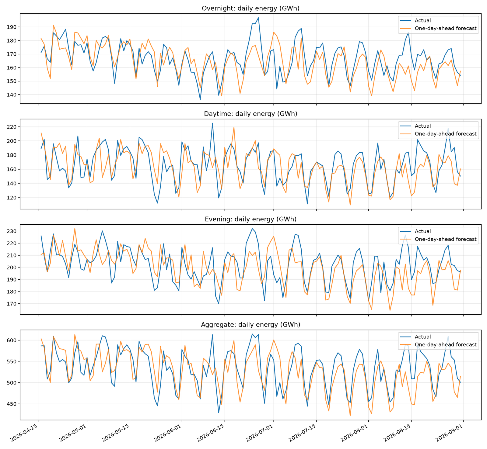
Figure 1. One-day-ahead forecasts and actuals for each break and the aggregate.
What to look for
The most important question isn’t simply whether the two lines are close.
Look for differences in behavior between panels.
For example:
-
If the aggregate matches closely but daytime is consistently underestimated, another break may be compensating with overestimation.
-
If all three breaks exhibit the same directional error, the problem may affect a shared forecasting assumption.
-
If only one break deteriorates, investigate inputs or modeling decisions specific to that component.
-
If errors appear disproportionately on particular days of the week, the forecast may not adequately represent calendar effects.
Because the three dayparts partition the same measured series, their signed errors add exactly to the aggregate signed error.
Using our sign convention:
Error = Actual − Forecast
A positive error represents underforecasting. A negative error represents overforecasting.
Why cumulative plots reveal more
The second figure compares cumulative aggregate actual and forecast energy, then shows cumulative signed error for every break.
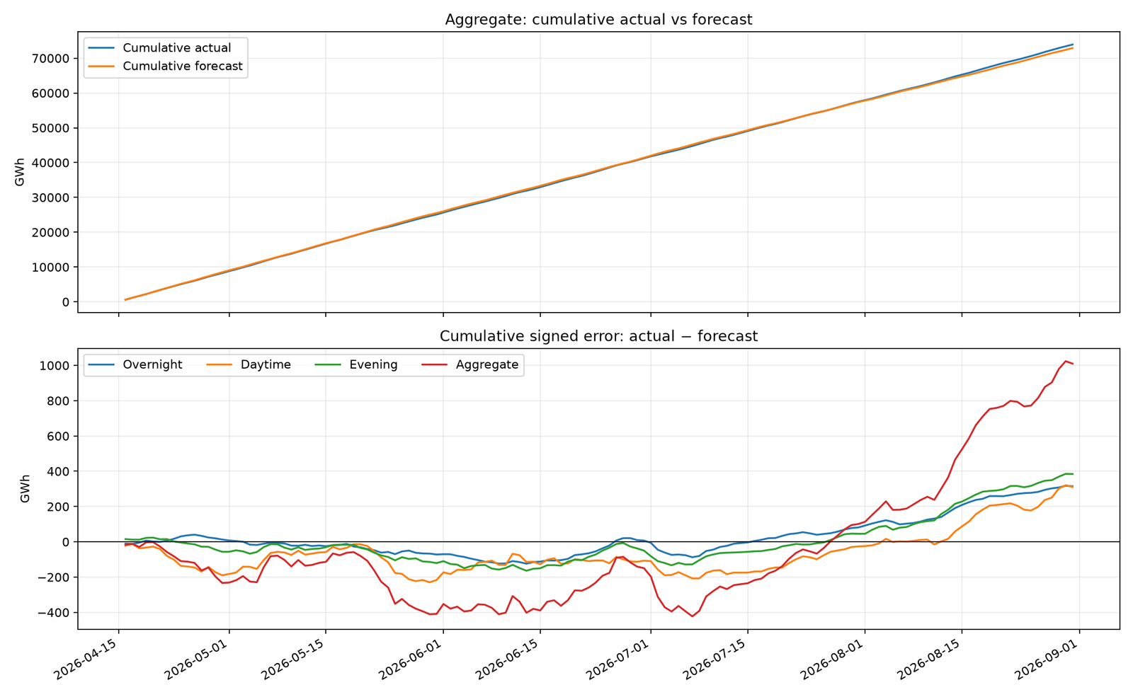
Figure 2. Cumulative actual-versus-forecast energy and cumulative signed errors.
Cumulative error through day T is calculated as:
CumulativeError(T) = sum of (Actual − Forecast) from day 1 through T
Suppose the forecast underestimates demand by only 2 GWh per day for 90 consecutive days.
The cumulative error reaches 180 GWh.
On a daily plot, 2 GWh might appear unimportant relative to total electricity demand. On the cumulative-error chart, the persistent directional imbalance becomes obvious.
There are two complementary interpretations:
Cumulative actual versus cumulative forecast shows the difference in total planned and observed quantities. When the totals are large, even substantial cumulative errors may be hard to see because the two lines nearly overlap.
Cumulative signed error magnifies the net discrepancy. A consistently rising line indicates underforecasting; a falling line indicates overforecasting. A roughly horizontal line indicates that positive and negative errors have recently offset one another.
However, a flat cumulative-error line is not proof of accurate component forecasts.
That leads to an important limitation: cumulative signed errors can cancel.
The cherry on the cake: a perfectly accurate aggregate can hide large errors
Consider a single target day with the following component errors.
| Break | Signed error |
|---|---|
| Overnight | +18 GWh |
| Daytime | −11 GWh |
| Evening | −7 GWh |
| Aggregate | 0 GWh |
The aggregate forecast is exactly correct.
Yet the sum of the absolute component errors is 36 GWh.
An aggregate-only dashboard would report zero error. Component-level monitoring would reveal substantial forecasting mistakes.
This is why accurate reconciliation and hierarchical monitoring are not interchangeable with aggregate accuracy.
In a production application, aggregate monitoring should be accompanied by control charts on the most operationally important breaks.
7. Control charts: detect when the forecast process changes
A forecast error is a time-series observation of a process.
We can therefore use statistical process control to ask whether its behavior remains consistent with a reference period.
This is not the same as claiming that forecasting errors should always resemble independent Gaussian noise. Demand forecasts often have seasonal effects, autocorrelation, and changing variance.
But control charts are valuable when their assumptions and calibration are treated explicitly.
Our demonstration uses:
-
A baseline ending June 15, 2026.
-
Monitoring beginning June 16.
-
An injected forecast-process change beginning with the July 10 issue.
-
A one-day-ahead aggregate signed-error series.
The first error affected by the intervention can occur for the July 11 target.
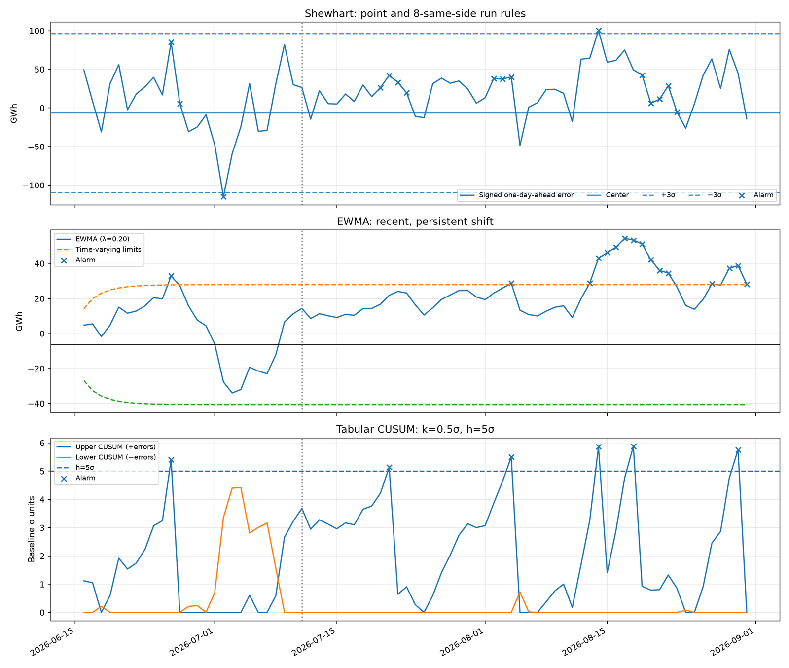
Figure 3. Shewhart, EWMA, and upper/lower tabular CUSUM, including control limits and alarm markers.
7.1 Shewhart chart: monitor unusual individual errors
A Shewhart chart compares individual errors with a reference mean and standard deviation.
We estimate both quantities from the baseline period:
-
μ = mean baseline signed error.
-
σ = sample standard deviation of baseline signed error.
-
Upper control limit = μ + 3σ.
-
Lower control limit = μ − 3σ.
An individual monitoring observation outside these limits is flagged.
For example, suppose the baseline error mean is 1 GWh and its standard deviation is 8 GWh.
The upper control limit is 25 GWh, and the lower control limit is −23 GWh.
A 28 GWh error would exceed the upper limit.
Under an idealized stable process with independent normally distributed errors and known parameters, roughly 0.27% of individual observations fall beyond two-sided three-sigma limits. Estimated parameters, distribution shape, and serial dependence all change the practical false-alarm behavior.
The three-sigma limits are not prediction intervals for the demand forecast. They are reference limits for monitoring a historical error process.
Add run rules
A process can shift without immediately producing three-sigma observations.
For that reason, the program implements an additional rule:
Flag eight consecutive monitoring errors strictly above or strictly below the baseline mean.
Imagine daily errors of +5, +4, +6, +3, +7, +5, +4, and +6 GWh, all above a zero-centered baseline.
None may individually breach a three-sigma limit. Nevertheless, eight consecutive errors with the same sign relative to the center suggest a sustained directional change.
Run rules add sensitivity but also increase the false-alarm rate. They should be included in alarm calibration, not treated as a free improvement.
Shewhart charts are especially effective for large isolated deviations, such as a sudden input failure or an exceptional miss.
They are generally less sensitive than purpose-designed accumulation methods to small but persistent changes.
7.2 EWMA: accumulate evidence of sustained bias
An exponentially weighted moving average gives greater weight to recent observations while retaining information from previous errors.
The update rule is:
zₜ = λeₜ + (1 − λ)zₜ₋₁
Here:
-
eₜ is the current forecast error.
-
zₜ is the updated exponentially weighted error.
-
λ controls the weight assigned to the latest error.
Our implementation uses λ = 0.20.
This means the new error receives 20% weight, while the previous EWMA value receives 80%.
For intuition, suppose the previous EWMA is 2 GWh and today’s error is 12 GWh.
The new EWMA becomes:
z = 0.20 × 12 + 0.80 × 2 = 4 GWh
One large error increases the statistic, but not as dramatically as it increases the raw observation.
Repeated positive errors push the EWMA higher over successive days.
Why the limits change over time
When the EWMA starts at the known baseline center, its variance begins below its long-run variance and grows toward a steady-state value.
Consequently, using the long-run limit width immediately is unnecessarily conservative during initialization.
Our script calculates the limit half-width at monitoring observation t as:
Width(t) = L × σ × √[(λ / (2 − λ)) × (1 − (1 − λ)^(2t))]
The upper and lower limits are μ + Width(t) and μ − Width(t).
We use L = 3, but note that this value is a multiplier for the EWMA standard deviation rather than the same threshold applied to raw Shewhart observations.
The formula assumes a stable error variance and the usual independence model. Forecast errors with serial correlation require more careful calibration.
Choosing λ
There is no universally optimal smoothing value.
A smaller λ, such as 0.10, smooths the series more heavily and gives relatively greater persistence to old information.
A larger λ, such as 0.30, reacts more strongly to individual recent errors.
Use a smaller value when the operational concern is a sustained modest shift and the monitoring sequence is reasonably stable. Favor a larger value when quicker responsiveness is worth additional sensitivity to short-term noise.
The best choice should be validated against the sizes and durations of shifts that matter operationally.
7.3 Tabular CUSUM: detect persistent positive and negative shifts
CUSUM is designed to accumulate evidence that a process mean has moved away from its reference value.
Unlike EWMA, a tabular CUSUM explicitly accumulates deviations only when they are sufficiently large in the relevant direction.
We first standardize each error relative to the baseline:
yₜ = (eₜ − μ) / σ
Then calculate the upper and lower statistics:
C⁺ₜ = max(0, C⁺ₜ₋₁ + yₜ − k)
C⁻ₜ = max(0, C⁻ₜ₋₁ − yₜ − k)
The upper statistic accumulates evidence of increasing signed error, which corresponds to stronger underforecasting relative to baseline.
The lower statistic accumulates evidence of decreasing signed error, corresponding to stronger overforecasting.
The program uses:
-
k = 0.5, expressed in baseline standard-deviation units.
-
h = 5, the decision threshold in the same standardized units.
An alarm is recorded when either statistic exceeds h.
Because our statistic is standardized, k = 0.5 corresponds to half a baseline standard deviation in the original error scale.
This is a conventional reference value for a CUSUM designed to detect an approximately one-standard-deviation mean shift under idealized assumptions. It is not guaranteed to be optimal for these particular forecast errors.
The upper and lower statistics are reset after recording an alarm, enabling the chart to identify further episodes.
Importantly, resetting after an alarm is an operating policy. In practice, a team might prefer to reset only after investigating and resolving the suspected process change.
7.4 Which control chart catches a shift first?
The answer depends on the magnitude, duration, noise structure, and tuning of the process change.
| Situation | Typical strength |
|---|---|
| Large, isolated forecasting mistake | Shewhart |
| Sustained moderate bias | EWMA |
| Small persistent directional shift | CUSUM |
| Several consecutive errors on one side | Shewhart run rule |
| Short-lived random fluctuations | No method should signal too frequently |
These are tendencies, not guaranteed rankings.
Our script reports the first flagged date on or after the intervention becomes observable and counts flagged dates before that point.
This distinction matters because a method that alarms earliest after a change may also produce more false alarms beforehand.
The date printed by the experiment is an empirical result of that specific data and parameter configuration. It should not be generalized into a universal detection-delay guarantee.
An even stronger comparison would repeat the experiment over many seeded realizations and process-shift magnitudes, then measure average detection delay alongside false-alarm performance.
That exercise becomes particularly important before making control charts part of an operational incident-management process.
7.5 What happened on the real data
Here is what the run above actually measured on the aggregate one-day-ahead error. The injected change starts with the July 10 issue, so it first touches target day July 11. The pre-intervention baseline (n = 61 days) has a centre of −6.38 GWh and σ = 34.30 GWh, and the injected bias works out at about +24.8 GWh/day, roughly 0.7σ.
| Chart (settings) | First alarm on or after July 11 | Delay | Flagged dates before July 11 |
|---|---|---|---|
| Shewhart, ±3σ points + 8-same-side run rule | July 20 | 9 days | 3 |
| Tabular CUSUM (k = 0.5σ, h = 5σ) | July 21 | 10 days | 1 |
| EWMA (λ = 0.20, L = 3) | August 4 | 24 days | 1 |
Three things are worth noticing:
- Shewhart answered first, but only because of its run rule: a 0.7σ bias almost never pushes a single day past ±3σ, while eight consecutive positive errors become likely quickly. It also paid for that speed with the most flags before the change.
- CUSUM was nearly as fast with a third of the early flags. Its allowance k = 0.5σ is designed for shifts of about 1σ, which is close to this one. For a smaller drift you would lower k to roughly half the shift you care about.
- EWMA with λ = 0.20 smooths heavily and needed 24 days at L = 3. A smaller λ with a slightly narrower L is the usual way to tune it for small persistent shifts.
These dates describe one realization on one snapshot. Treat them as an illustration of the trade-off between detection delay and false alarms, not as a ranking.
8. Vintage envelopes: visualize forecast disagreement across issues
Control charts focus on errors after actual outcomes are available.
Vintage envelopes answer a different question:
How much did successive forecast issues disagree about the same future date?
For a given target day, collect every forecast issue that predicted that day.
With a seven-day horizon and daily issuance, an interior target can have seven distinct forecast values.
For each target day, calculate:
-
Minimum forecast across available issues.
-
Maximum forecast across available issues.
-
10th percentile across issues.
-
90th percentile across issues.
-
Actual observed demand.
The resulting plot places the observed outcome alongside two forecast envelopes.
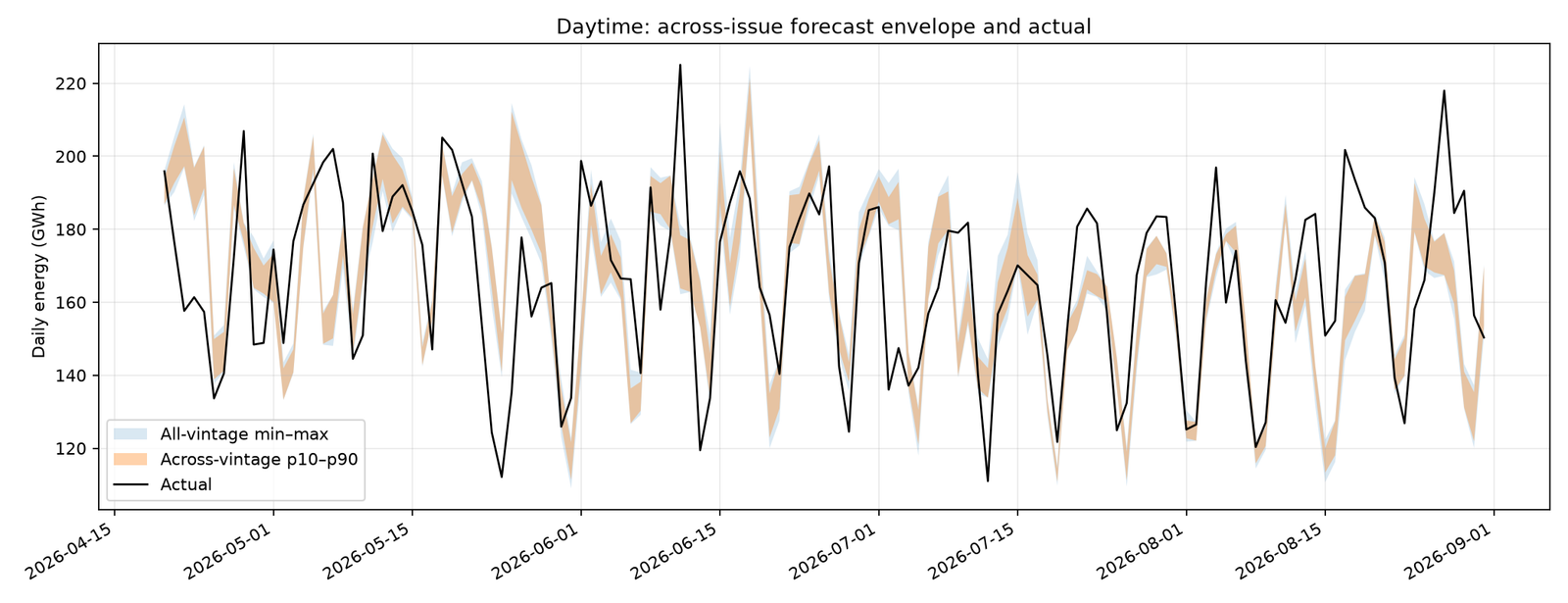
Figure 4. Minimum–maximum and p10–p90 ranges across forecast vintages for the daytime break, overlaid with actuals.
How to interpret the envelope
The outer band shows the minimum and maximum predictions ever issued for a particular target within the available issue window.
The inner band shows the 10th to 90th percentile of those forecasts.
If the actual falls outside the outer band, then every recorded issue for that target was wrong in the same direction relative to the actual.
If the actual falls inside the outer band but outside the inner band, only a smaller part of the vintage distribution extends far enough toward the observed outcome.
A wide band indicates substantial disagreement across revisions. A narrow band indicates that successive issues made similar predictions.
But narrow disagreement does not necessarily mean accuracy.
A forecasting model can repeatedly issue nearly identical predictions and still be consistently wrong.
A vintage envelope is not an 80% prediction interval
This is one of the most important statistical distinctions in forecast monitoring.
The interval between the 10th and 90th percentile of forecast vintages contains roughly the middle 80% of the available forecast values according to the chosen empirical quantile convention.
It does not imply an 80% probability that the outcome lies inside that interval.
Why not?
Because the different vintages are not independent draws from an outcome distribution.
They are sequential model outputs with different issue dates, lead times, and potentially different information sets.
They are also strongly dependent because most of the forecasting mechanism is shared.
To call an interval an 80% predictive interval, its coverage would need to be justified by an appropriate probabilistic forecasting and calibration method.
Our envelope is a revision-dispersion diagnostic, not a calibrated uncertainty estimate.
Avoid another subtle comparison error
Near the beginning and end of the available issue history, not every target has seven forecasts.
If only one or two issues exist for a target, the envelope can appear artificially narrow.
The program therefore requires at least five issues for a target to appear in the envelope chart.
For operational use, an even more consistent approach is to compare target dates using the same lead-time window or report issue counts alongside the envelope.
Remember also that the completed envelope is retrospective. A forecast issued later cannot legitimately be included in information presented as available at an earlier decision time.
9. Revision charts: detect changes before actuals arrive
Revision monitoring is where the distinction between issue dates and target dates becomes especially valuable.
Suppose a forecast run issued on July 9 predicts demand for July 12, 13, and 14.
The July 10 run predicts those same dates again.
We can compare the two runs on their overlapping targets without waiting for any of the target days to occur.
That gives us a direct diagnostic of changing forecasts.
Define a matched-target revision
For target day t and consecutive issues i−1 and i:
Revision(i, t) = Forecast(i, t) − Forecast(i−1, t)
A positive revision means the newer issue predicts a higher value for that same target.
A negative revision means the newer issue predicts a lower value.
For every pair of consecutive issues, our script calculates three metrics across the shared target days.
Mean revision per target day
MeanRevision = sum of matched revisions / number of matched targets
This measures the average directional change to the forecast level.
Total revision
TotalRevision = sum of matched revisions
This measures the net change in forecast energy across the shared target days.
Percentage revision
PercentRevision = 100 × TotalRevision / sum of older matched forecasts
This normalizes the net revision relative to the older issue’s total forecast quantity over exactly the same target set.
A worked numerical example
Suppose two consecutive issues have six overlapping target days.
The older issue forecasts 3,000 GWh in total across those six days.
The newer issue forecasts 2,940 GWh across those same days.
We obtain:
-
Total revision = −60 GWh.
-
Mean revision = −10 GWh per target day.
-
Percentage revision = −2%.
All three measures convey useful information.
The mean helps compare typical level changes. The total shows the overall quantity revised. The percentage facilitates comparison across breaks of different sizes.
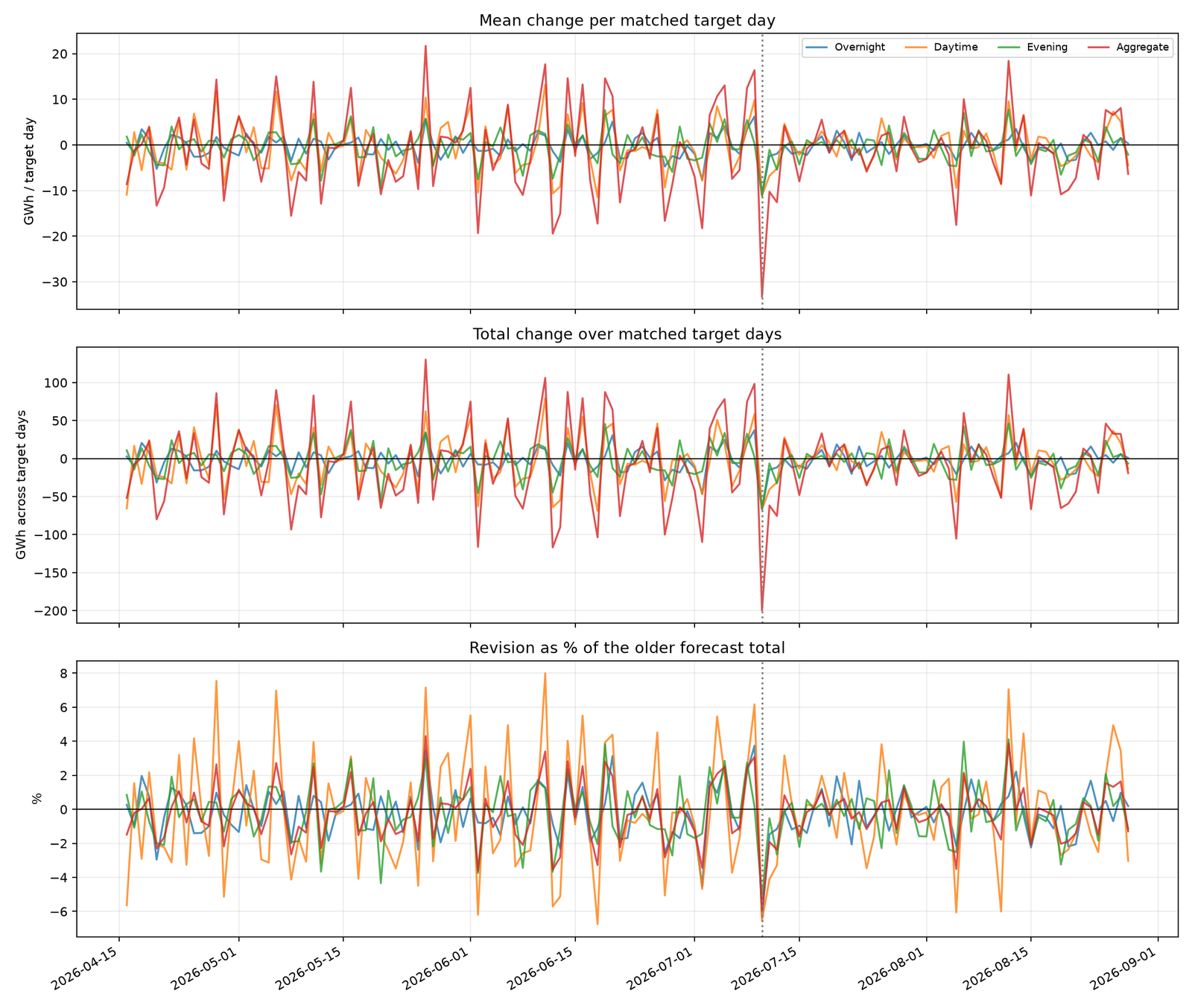
Figure 5. Consecutive-issue matched-target revisions: mean, total, and percentage changes for each break and the aggregate.
Why matching target dates is essential
Comparing the full seven-day total from one issue with the full seven-day total from the next would be misleading.
One date exits the horizon and a new date enters.
The resulting difference would mix genuine reforecasting with changes in the target set.
Our approach uses an inner join on the target date and calculates changes only for targets common to both issues.
It also requires consecutive calendar-day issues and at least three matched targets.
An ordinary pair of complete seven-day issues has six overlapping target days.
Note that even after matching targets, the new forecast is one day closer to each target. Some revision is therefore expected simply because information accumulates as the horizon shortens.
To distinguish normal lead-time convergence from abnormal revisions, a mature implementation should compare observed revisions with a baseline of typical revisions at the same lead-time transition.
An early-warning advantage
Here’s a particularly useful operational property of revision charts.
Our simulated forecasting change begins on the issue dated July 10.
The revision chart can observe that run’s changed predictions immediately when the new issue is produced.
A forecast-error chart cannot observe the corresponding outcome error until the target has occurred and its actual value becomes available.
That means a revision chart can reveal a forecasting regime change before an error-monitoring chart has any new outturn to evaluate.
It doesn’t prove that the revision is wrong. New information could justify it.
But it gives operators an earlier opportunity to ask why an entire issue moved upward or downward.
Revision charts complement error-based monitoring; they do not replace it.
10. How to move from a demonstration to reliable production monitoring
The code provides a complete reproducible experiment, but a deployment should add controls around data provenance, statistical calibration, and alert handling.
Separate actual availability from target dates
In real operations, the date being forecast and the timestamp when its actual becomes available are distinct.
NESO’s historical dataset is not a zero-latency stream. Its published data can arrive with a lag and can undergo corrections.
National Energy System Operator
An operational system should therefore retain:
-
The immutable forecast issue timestamp.
-
The forecast’s target interval.
-
The timestamp at which an actual was first available.
-
The version of the actual used to calculate an error.
-
Any subsequent actual-data revision.
Otherwise, a retrospective dashboard might show an apparent alarm on a target date even though that observation could not have triggered an alert until much later.
Maintain statistically appropriate baselines
A single mean and standard deviation are useful for demonstrating control charts, but often too simplistic for real forecasting systems.
Forecast-error behavior can vary by:
-
Lead time.
-
Day of the week.
-
Holiday status.
-
Season.
-
Break or product line.
-
Demand level.
-
Forecast-model version.
Consider separate monitoring baselines for these conditions when sufficient observations are available.
An alternative is to monitor suitably standardized residuals from a stable error model rather than raw errors.
However, normalization can introduce its own risk: if you continually estimate the baseline using observations from a deteriorating process, your control limits may gradually absorb the very bias you’re trying to detect.
For a deployment, define when baselines are frozen, reviewed, and deliberately recalibrated.
Calibrate alarms against an operational false-alarm budget
Our Shewhart, EWMA, and CUSUM configurations are illustrative reference choices.
They are not calibrated to an equal false-alarm rate.
A fair operational comparison should estimate the behavior of each complete rule set under a stable process, including the Shewhart run rule.
For correlated forecasting errors, consider validation using historical stable periods, block resampling, or realistic process simulations that preserve temporal dependence.
Measure:
-
False alerts per monitoring period.
-
Detection delay for relevant shift magnitudes.
-
Detection probability within an operationally useful time window.
-
Number of alerts requiring human investigation.
-
Stability after an alert is acknowledged or reset.
Also remember that monitoring many breaks simultaneously increases the chance of at least one false signal. Per-break rules need a portfolio-level alert policy.
Keep accuracy, stability, and revisions separate
These diagnostics answer different questions.
| Monitoring dimension | Core question | Useful measures |
|---|---|---|
| Accuracy | How wrong were the forecasts? | MAE, RMSE, signed bias |
| Process stability | Have errors changed from baseline? | Shewhart, EWMA, CUSUM |
| Cumulative impact | How much net discrepancy has accumulated? | Cumulative signed error |
| Aggregation quality | Are component errors cancelling? | Break errors versus aggregate error |
| Vintage dispersion | How much did forecast issues disagree? | Min–max, p10–p90 |
| Revision behavior | Are new issues moving systematically? | Mean, total, percentage revisions |
A system can perform well on one dimension and poorly on another.
For instance, low absolute forecast error does not guarantee stable revisions. Small vintage dispersion does not guarantee good calibration. A stable mean error does not guarantee the absence of major isolated misses.
That is why combining these views is more informative than reducing everything to a single accuracy score.
11. A practical workflow for investigating forecast alarms
Suppose the aggregate CUSUM raises a positive-side signal.
A reasonable investigation sequence is:
-
Confirm the data. Check that the actual and forecast refer to the same target, units, time zone, and forecast lead.
-
Inspect the breakdowns. Determine whether the change affects one series or several.
-
Review cumulative signed error. Quantify the operational consequence of the recent imbalance.
-
Inspect the vintage envelope. Determine whether different issues had already disagreed substantially about those targets.
-
Check the revision chart. Look for a systematic level change around the date the error process deteriorated.
-
Inspect the model and inputs. Investigate altered features, new data sources, calendar assumptions, model deployments, and changed forecast configurations.
-
Record the finding. Distinguish a genuine process shift from a data-quality error or an expected change in operating conditions.
The goal is not to automatically declare a forecasting model defective whenever a control limit is exceeded.
A control-chart alarm is evidence that the observed sequence warrants investigation under the chosen monitoring model.
That investigation may reveal a modeling problem, an operational event, a data correction, or a weakness in the monitoring baseline itself.
12. Further experiments worth running
Once the complete pipeline works, several extensions are particularly valuable.
First, change the injected shift magnitude. Try 1%, 2%, 5%, and 10% decreases in forecast level. Compare the methods’ delays and false alarms. A CUSUM may be more useful for a persistent small shift, while a Shewhart chart may be sufficient for a very large shift.
Second, change the forecast horizon. Repeat error monitoring at fixed leads of one, three, and seven days. The error distribution and detectable biases may differ considerably by horizon. Estimate separate baselines rather than pooling the horizons indiscriminately.
Third, monitor each break independently. Calibrate separate chart centers and limits for overnight, daytime, and evening energy. Compare the resulting alerts with the aggregate alerts and identify cases of cancellation.
Fourth, normalize revisions. Build a historical distribution of typical revisions for each transition between lead times. Then monitor whether a new issue’s revisions are unusual relative to comparable historical issue pairs.
Fifth, assess envelope coverage. Measure how often outcomes fall inside the empirical vintage envelope. This quantifies descriptive coverage, but does not convert the envelope into a calibrated probabilistic interval. If uncertainty forecasting is required, build and validate a separate probabilistic model.
These experiments turn a plotting exercise into a more rigorous forecasting reliability program.
13. Final checklist and next steps
A production-quality forecast-monitoring system should preserve vintage history, evaluate fixed-horizon errors, monitor component and aggregate behavior, and keep revision diagnostics distinct from forecast accuracy.
Use this checklist before deploying:
- Forecast issues and target dates are stored separately.
- Every issue–target–break combination is unique.
- Forecast and actual units are consistent.
- Breaks reconcile correctly to the aggregate.
- Error comparisons use a fixed forecast horizon.
- Control limits are calibrated on a designated stable baseline.
- EWMA and CUSUM initial conditions and reset behavior are documented.
- Missing dates and revised actuals are handled explicitly.
- Vintage envelopes are not mislabeled as predictive intervals.
- Consecutive-issue revisions match identical target dates.
- Alert investigations have a documented owner and response procedure.
The central lesson is that forecast monitoring should examine the behavior of the forecasting process, not merely summarize the size of its mistakes.
Shewhart charts help surface exceptional errors. EWMA and CUSUM reveal sustained departures from a stable error process. Cumulative plots expose persistent net bias. Breakdown charts uncover cancellation. Vintage envelopes and revision charts reveal how the forecast itself evolves between issues.
Used together, they help answer not only whether forecasts were wrong, but when the process changed, which components contributed, and whether there were warning signs before the actual outcomes arrived.
Your next step: Run the provided pipeline, inspect all five generated figures, then repeat the experiment with a smaller injected forecast bias. Compare which control chart signals first, whether the revision chart detects the issue-level change earlier, and how much cumulative error develops before the monitoring system reacts.