
LEARN · EXPLORATORY DATA ANALYSIS & STATISTICS
A dataset with 64 features cannot be plotted directly on a two-dimensional screen. But a machine learning engineer can transform those 64 features into two coordinates and produce a surprisingly beautiful visualization.
The trouble begins when that beautiful visualization is mistaken for the truth.
Three of the most widely used techniques for dimensionality reduction are Principal Component Analysis (PCA), t-distributed Stochastic Neighbor Embedding (t-SNE), and Uniform Manifold Approximation and Projection (UMAP).
All three can convert high-dimensional data into a 2D scatter plot. However, they preserve different properties of the original data, optimize different objectives, and can lead to very different interpretations.
A cluster that looks perfectly separated under t-SNE might overlap under PCA. UMAP might arrange the same observations into a continuous structure. None of these outcomes automatically proves that one method is correct and the others are wrong.
In this tutorial, we’ll explore the mathematics, run all three techniques on exactly the same dataset, investigate their hyperparameters, and learn how to determine whether a visualization deserves our trust.
By the end, you’ll understand:
-
What each technique actually preserves and sacrifices.
-
Why linear projections and nonlinear embeddings behave differently.
-
How to implement all three with modern Python libraries.
-
How perplexity, neighborhood size, and minimum distance change the result.
-
Why visually separated clusters are not necessarily real clusters.
-
How to measure neighborhood preservation instead of relying entirely on appearances.
-
Which technique to choose for different analytical tasks.
1. The dimensionality reduction problem
Imagine a dataset containing 10,000 customer transactions. Each transaction has 200 numerical features describing quantities, spending patterns, product preferences, timing, and other characteristics.
Mathematically, one transaction is a point in a 200-dimensional feature space.
Two transactions are similar if their feature vectors are close according to an appropriate distance metric.
Unfortunately, people cannot directly visualize 200-dimensional space.
Dimensionality reduction constructs a mapping from the original feature space into a smaller space, often two or three dimensions.
For a visualization, the transformation looks like this:
Conceptual illustration: many original features become two plotted coordinates.The difficulty is that reducing dimensions inevitably discards or distorts some information.
A useful projection might try to preserve:
-
Global structure: the broad arrangement of observations and groups.
-
Local structure: which observations are nearest neighbors.
-
Variance: directions along which the data changes most.
-
Topology: connections and continuous relationships among observations.
-
Distances: how far apart observations are under the original metric.
These goals are not equivalent.
A projection that preserves variance might hide an important curved structure. Another that preserves local neighborhoods might distort distances between groups.
Therefore, the right question is not simply, “Which algorithm produces the best plot?”
It is:
Which aspects of the original data must remain trustworthy for the question I’m investigating?
2. PCA: the linear baseline everyone should try first
Principal Component Analysis finds orthogonal directions that capture the greatest possible variance in the input data.
The first principal component is the direction along which the centered data varies most.
The second principal component captures the largest remaining variance while remaining perpendicular to the first.
Subsequent components follow the same principle.
See the scikit-learn decomposition guide for the full definition.
How PCA works
Suppose our dataset is represented by a matrix X with 1,000 rows and 50 columns.
-
Each row represents one observation.
-
Each column represents one feature.
-
The columns are centered by subtracting their means.
-
Singular Value Decomposition (SVD) identifies the principal directions.
-
The observations are projected onto the first two directions.
Conceptually:
-
Center the data.
-
Find the directions of maximum variance.
-
Keep the two strongest directions.
-
Project the data onto them.
For a centered matrix, the principal-component scores can be written as:
Z = X_centered · W
Here, W contains the selected principal directions, and Z contains the projected coordinates.
PCA is linear because each output coordinate is a weighted sum of the original features.
What PCA preserves
PCA is excellent when the data has strong linear relationships.
Its important properties include:
-
The selected principal components are orthogonal.
-
The first two components maximize retained variance among two-dimensional orthogonal linear projections.
-
Euclidean distances between points cannot increase under an orthogonal projection into fewer dimensions.
-
The same fitted transformation can be applied to previously unseen observations.
-
Component loadings allow us to inspect which original features contribute to each direction.
PCA also provides the explained variance ratio, which tells us what proportion of total variance each component captures.
If the first two components explain 85% of the variance, that’s useful evidence about how much information they retain under a variance-based criterion.
However, it does not mean that they preserve 85% of the class separation, neighborhood relationships, or predictive information.
A low-variance direction can still be important for classification or anomaly detection.
The limitations of PCA
PCA cannot automatically unravel arbitrary nonlinear structures.
Imagine observations arranged along a spiral or a rolled-up sheet. A straight-line projection might place points from different sections of the structure on top of one another.
Another limitation is sensitivity to feature scales.
If annual spending is measured in thousands and purchase frequency is measured in single digits, the spending feature may dominate PCA unless the scaling is handled appropriately.
Scikit-learn’s PCA implementation centers the data but does not automatically standardize each feature to unit variance. It also exposes multiple SVD solvers, so computation can be adapted to dataset size.
When should you use PCA?
Start with PCA when you need an efficient, interpretable baseline; want to inspect dominant sources of variance; or need a reusable linear transformation.
Even when a nonlinear method ultimately gives a more informative picture, PCA provides a valuable reality check.
3. t-SNE: preserving neighborhoods rather than directions
t-SNE approaches dimensionality reduction very differently.
Rather than searching for directions of maximum variance, it builds a probabilistic representation of similarities between observations.
It attempts to arrange points so that observations considered similar in the original space remain likely neighbors in the embedded space.
The intuition behind t-SNE
Imagine 1,000 product descriptions represented by high-dimensional text embeddings.
Each product has nearby neighbors representing semantically similar items.
t-SNE considers the neighborhood relationships in the original space and attempts to reproduce them on a 2D map.
The process has three broad stages:
-
Convert high-dimensional distances into similarity probabilities.
-
Construct similarity probabilities for points in the low-dimensional embedding using a heavy-tailed Student t-distribution.
-
Optimize the embedded coordinates to minimize the Kullback–Leibler divergence between those probability distributions.
The heavy-tailed distribution helps alleviate the crowding problem, where many moderately separated high-dimensional neighbors cannot all be placed at comparable distances in two dimensions.
The result can reveal local groupings that a linear projection obscures.
What makes t-SNE compelling?
t-SNE is especially useful for exploratory inspection of:
-
Learned image or text embeddings.
-
High-dimensional representations from neural networks.
-
Collections of similar products or documents.
-
Data with potentially nonlinear neighborhood structure.
It frequently produces clear, visually distinguishable groups.
But there is a critical limitation: it does not promise faithful global geometry.
Two islands separated by a large gap in a t-SNE plot are not necessarily much more different than two islands separated by a small gap.
Similarly, the plotted area of a cluster does not reliably describe its dispersion in the original space.
We’ll demonstrate this important behavior later.
Perplexity: the central t-SNE hyperparameter
Perplexity influences the effective neighborhood scale.
A smaller perplexity emphasizes very local relationships. A larger one incorporates broader neighborhoods.
Typical exploratory choices include:
-
5–15: more emphasis on fine local structure, but greater sensitivity to noise.
-
30: a useful initial reference point for many datasets.
-
50–100: broader neighborhoods, worth examining when sample size supports them.
These are experiments, not universal prescriptions.
Perplexity must be smaller than the number of samples. A value that works for 10,000 observations might be unsuitable for a dataset containing 100.
Current scikit-learn versions expose the max_iter parameter for optimization and use learning_rate="auto" by default. Older examples using the former n_iter argument should be updated.
What t-SNE does not provide
The standard scikit-learn implementation is primarily a dataset-level visualization tool.
It has a fitting method that generates an embedding, but no general-purpose transform() method for embedding new observations into the existing map.
This distinction matters for applications where new transactions, documents, or sensor readings arrive continuously.
For such tasks, PCA or UMAP usually offers a more convenient workflow.
4. UMAP: learning the structure of neighborhoods
UMAP is another nonlinear dimensionality reduction technique, but its construction differs from t-SNE.
It draws on ideas from manifold learning and topology.
The underlying intuition is that high-dimensional observations may lie near a lower-dimensional structure, even when their coordinates are expressed using hundreds or thousands of features.
UMAP attempts to represent important neighborhood relationships from that structure in fewer dimensions.
How UMAP works
At a conceptual level, UMAP:
-
Identifies nearby observations using a chosen distance metric.
-
Builds a weighted graph representing local neighborhood relationships.
-
Combines those relationships into a fuzzy representation of the dataset’s structure.
-
Initializes a lower-dimensional embedding.
-
Optimizes the coordinates so that the lower-dimensional graph approximates the original neighborhood relationships.
UMAP uses an attractive-and-repulsive optimization process that encourages strongly connected points to remain close while discouraging unrelated points from collapsing together.
Like t-SNE, UMAP is nonlinear and does not preserve every original distance.
Its mathematical framework differs, however, and the resulting layouts can exhibit different balances between local and broader neighborhood structure.
The important hyperparameters
Neighborhood size (n_neighbors)
The neighborhood-size parameter determines the scale of the local structure UMAP tries to learn.
-
Smaller values emphasize fine-grained relationships and may produce fragmented-looking groups.
-
Larger values incorporate broader relationships and may produce smoother, more connected layouts.
For example, values of 10, 30, and 100 represent meaningfully different views of the same dataset.
Minimum distance (min_dist)
The minimum-distance parameter influences how tightly points can be packed in the embedding.
-
Values near zero allow very tight concentrations.
-
Values around 0.1 often produce compact groups while maintaining some internal spread.
-
Larger values, such as 0.5, encourage more distributed layouts.
Importantly, minimum distance is a layout-control parameter, not a promise that every pair of plotted points will be separated by a literal minimum number of coordinate units.
Changing it can dramatically alter how cluster-like the visualization appears.
Distance metric (metric)
The input-space metric determines what UMAP considers similar.
Euclidean distance may be appropriate for normalized numerical measurements. Cosine distance may be preferable for some text embeddings.
Choosing an inappropriate distance metric can undermine the analysis before the visualization begins.
These parameters and their effects are documented in the UMAP project’s parameter guide.
What makes UMAP different in practice?
UMAP provides a fitted transformation that can be used to embed new observations without rebuilding the entire visualization.
This is useful for applications involving incoming data.
For example, imagine building a visualization of 50,000 product embeddings and subsequently receiving 200 new products.
A fitted UMAP model can transform the new embeddings into the existing coordinate system.
These new positions are approximations based on the learned structure, not guarantees that a complete refit would produce identical coordinates.
UMAP also supports embeddings with more than two dimensions, making it relevant beyond visualization.
However, reducing data to two dimensions for a downstream predictive model is not automatically beneficial. Any predictive advantage must be established through appropriate validation.
5. The three methods at a glance
| Property | PCA | t-SNE | UMAP |
|---|---|---|---|
| Transformation | Linear | Nonlinear | Nonlinear |
| Main objective | Preserve variance | Preserve local similarity probabilities | Preserve weighted neighborhood structure |
| Global geometry | Retains broad linear structure when represented by dominant components | Generally unreliable | Sometimes informative, but not guaranteed |
| Local neighborhoods | May lose nonlinear neighborhoods | Major focus | Major focus |
| New-data transformation | Yes | Not in standard scikit-learn implementation | Yes |
| Feature interpretation | Component loadings available | No direct feature-level interpretation | No direct feature-level interpretation |
| Reproducibility | Deterministic with an exact solver on fixed input, apart from component sign conventions | Seed- and optimization-dependent | Seed- and implementation-dependent |
| Typical use | Baselines, compression, interpretation | Exploratory neighborhood visualization | Exploration and reusable embeddings |
The key conclusion is that these techniques solve related but different optimization problems.
We should not expect identical plots.
And we should not select a method simply because its visualization looks cleaner.
6. Hands-on project: PCA, t-SNE, and UMAP on the same dataset
Now we’ll move from theory to implementation.
The goal is to construct a reproducible comparison in which all three techniques receive exactly the same input observations.
We’ll use the handwritten digits dataset included with scikit-learn.
It contains:
-
1,797 grayscale images.
-
Ten digit classes, from 0 through 9.
-
Images measuring 8 × 8 pixels.
-
64 numerical features per image.
Each image is represented as a flattened vector of 64 pixel intensities.
The dataset is compact enough to experiment with on an ordinary laptop while containing meaningful nonlinear variation in handwriting styles.
It is also useful because the ground-truth digit labels provide an external reference for examining the visualizations.
Those labels will be used for coloring and interpretation, not for fitting the dimensionality reduction models.
Step 1: Set up the environment
Use Python 3.11 or 3.12 and create an isolated virtual environment.
On macOS or Linux:
python -m venv .venv
source .venv/bin/activate
python -m pip install --upgrade pip
python -m pip install "scikit-learn==1.9.1" "umap-learn==0.5.12" "matplotlib>=3.10,<4"
These package selections correspond to the current 2026 APIs. Scikit-learn 1.9.1 was released in September 2026, and umap-learn 0.5.12 in April 2026.
The numerical dependencies, including NumPy and SciPy, will be resolved by the package installer.
The UMAP package also depends on Numba for performance. Its first execution may spend additional time compiling functions, so the initial run is not necessarily representative of subsequent execution time.
Step 2: Create the comparison script
Create a file named compare.py.
The script will:
-
Load and normalize the dataset.
-
Compute a two-dimensional PCA projection.
-
Fit a t-SNE embedding.
-
Fit a UMAP embedding.
-
Evaluate neighborhood preservation.
-
Save side-by-side visualizations and numerical results.
import matplotlib
matplotlib.use("Agg")

import matplotlib.pyplot as plt
import numpy as np

from sklearn.datasets import load_digits
from sklearn.decomposition import PCA
from sklearn.manifold import TSNE, trustworthiness
from umap import UMAP


RANDOM_STATE = 42

# Load the same dataset for every algorithm.
digits = load_digits()

X = digits.data.astype(np.float64) / 16.0
y = digits.target

print(f"Samples: {X.shape[0]}")
print(f"Features: {X.shape[1]}")
print(f"Classes: {len(np.unique(y))}")

# Method 1: PCA
pca = PCA(
    n_components=2,
    svd_solver="full",
)

X_pca = pca.fit_transform(X)

# Method 2: t-SNE
tsne = TSNE(
    n_components=2,
    perplexity=30,
    learning_rate="auto",
    init="pca",
    max_iter=1000,
    random_state=RANDOM_STATE,
)

X_tsne = tsne.fit_transform(X)

# Method 3: UMAP
umap_model = UMAP(
    n_components=2,
    n_neighbors=30,
    min_dist=0.1,
    metric="euclidean",
    random_state=RANDOM_STATE,
)

X_umap = umap_model.fit_transform(X)

embeddings = {
    "PCA": X_pca,
    "t-SNE": X_tsne,
    "UMAP": X_umap,
}

# Compare neighborhood preservation.
print("\nTrustworthiness at k=10:")

for name, coordinates in embeddings.items():
    score = trustworthiness(
        X,
        coordinates,
        n_neighbors=10,
        metric="euclidean",
    )
    print(f"{name:6s}: {score:.4f}")

print(
    "\nPCA explained variance:",
    f"{pca.explained_variance_ratio_.sum():.4f}",
)

# Visualize all three embeddings.
fig, axes = plt.subplots(
    1,
    3,
    figsize=(16, 5),
    layout="constrained",
)

for ax, (name, coordinates) in zip(
    axes,
    embeddings.items(),
):
    scatter = ax.scatter(
        coordinates[:, 0],
        coordinates[:, 1],
        c=y,
        cmap="tab10",
        vmin=-0.5,
        vmax=9.5,
        s=8,
        alpha=0.75,
        rasterized=True,
    )

    ax.set_title(name)
    ax.set_xlabel("Dimension 1")
    ax.set_ylabel("Dimension 2")
    ax.set_aspect("equal", adjustable="datalim")

fig.colorbar(
    scatter,
    ax=axes,
    ticks=range(10),
    label="Digit label",
    shrink=0.75,
)

fig.savefig(
    "dimensionality_comparison.png",
    dpi=180,
)

plt.close(fig)

# Save embeddings for later experiments.
np.savez_compressed(
    "digit_embeddings.npz",
    X=X,
    labels=y,
    pca=X_pca,
    tsne=X_tsne,
    umap=X_umap,
)

print("\nSaved dimensionality_comparison.png")
print("Saved digit_embeddings.npz")
Run the experiment:
python compare.py
The script produces two files:
-
dimensionality_comparison.png— the side-by-side visualization. -
digit_embeddings.npz— the original features, class labels, and three embeddings for further analysis.
Step 3: Why the preprocessing matters
Every image pixel in this dataset is originally measured on the same numerical intensity scale.
Dividing by 16 puts those intensities between 0 and 1 without changing their relative weights.
That means we’re not accidentally giving one pixel a greater influence simply because its measurement units are larger.
We deliberately avoid independent unit-variance standardization here.
Some peripheral pixels are nearly always zero. Standardizing every pixel separately would substantially increase the relative importance of pixels with very low variance.
That might be useful for a particular analysis, but it is not necessarily desirable for handwritten digits.
For a different dataset, such as mixed retail statistics containing monetary amounts, counts, and percentages, standardization may be essential.
The broader lesson is that preprocessing defines the geometry that dimensionality reduction attempts to preserve.
Step 4: Interpreting the three plots
Our run (Python 3.13, scikit-learn 1.9.1, umap-learn 0.5.12) printed:
Samples: 1797
Features: 64
Classes: 10

Trustworthiness at k=10:
PCA   : 0.8300
t-SNE : 0.9926
UMAP  : 0.9877

PCA explained variance: 0.2851
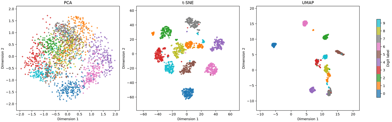
The resulting visualizations will not generally look alike.
PCA
The PCA plot is a linear projection of the 64-dimensional pixel space.
Some digits will overlap substantially because different handwritten numbers can share similar pixel patterns.
For example, variations of 3, 5, and 8 can have substantial similarities under raw pixel distances.
PCA may still reveal broad directions of variation without cleanly separating all ten classes.
In this example, the first two components explain approximately 28.5% of the dataset’s total pixel variance.
That leaves considerable variation outside the 2D projection.
t-SNE
The t-SNE plot will typically show more distinct local groupings.
Observations representing the same digit often share similar pixel patterns and therefore fall into similar neighborhoods.
However, we should not assume that every visually separated island represents a meaningful natural class.
Nor should we conclude that two digit classes are strongly related simply because their islands appear close together.
UMAP
UMAP will often reveal recognizable groupings while retaining some connected or continuous relationships between them.
The precise layout depends on the neighborhood graph and the optimization settings.
The interesting question is whether similar handwritten observations remain neighbors, not whether the resulting picture has aesthetically pleasing boundaries.
A crucial visualization warning
Notice that we did not force the three embeddings to share numerical axis limits.
There is a reason.
PCA coordinates are projections onto principal directions. t-SNE and UMAP coordinates are constructed by different nonlinear optimization objectives.
Their numerical scales are not directly comparable.
A distance of five units in one plot does not mean the same thing as a distance of five units in another.
And even within one nonlinear embedding, large distances between groups require caution.
7. Quantifying neighborhood preservation
Visual inspection is useful, but it is not enough.
A dense 2D plot can create an impression of convincing structure even when some neighborhood relationships are badly distorted.
We need at least one numerical diagnostic.
Trustworthiness
Scikit-learn provides a metric called trustworthiness.
It evaluates whether observations appearing as neighbors in the embedded space were also nearby in the original space.
Conceptually, imagine that a product embedding places two unrelated items next to each other.
If those items were distant in the original feature space, the embedding has created a misleading neighborhood.
Trustworthiness penalizes such false neighbors according to their original neighborhood ranks.
Its score lies between 0 and 1:
-
A score closer to 1 indicates better preservation under this criterion.
-
A lower score indicates more newly introduced neighbors that were not close originally.
The neighborhood count determines the scale of the evaluation.
This metric is implemented in scikit-learn as sklearn.manifold.trustworthiness.
What trustworthiness measures—and misses
There is a subtle but important distinction:
Trustworthiness is not a universal measure of embedding quality.
A method can achieve excellent local trustworthiness while strongly distorting global distances.
This is particularly relevant to t-SNE, which explicitly emphasizes local similarities.
Trustworthiness also does not directly answer whether original neighbors were incorrectly separated in the embedding. That complementary question concerns neighborhood continuity or recall.
For a rigorous evaluation, examine more than one property:
-
Trustworthiness at several neighborhood sizes.
-
Neighborhood overlap or recall between the original and embedded spaces.
-
Stability across different random seeds.
-
Whether relevant known groups remain meaningfully organized.
-
Whether interpretations survive reasonable hyperparameter changes.
You should also evaluate these properties using a distance metric appropriate for the original data.
A high trustworthiness score under a poorly chosen input metric does not rescue the analysis.
Why numerical evaluation is particularly important
Consider two embeddings.
Embedding A shows ten beautifully separated islands.
Embedding B shows somewhat overlapping groups but preserves more of the original nearest-neighbor relationships.
If your task is exploring semantic similarity among products, Embedding B could be more useful despite being less visually dramatic.
Conversely, if you are exploring classes of handwritten digits, clear local separation may help identify potentially ambiguous examples.
The choice depends on the analytical objective.
8. Hyperparameter sensitivity: the experiment most tutorials skip
A single embedding is rarely enough to establish a reliable interpretation.
This is especially true for stochastic nonlinear dimensionality reduction.
Let’s run a sensitivity experiment.
We’ll vary t-SNE perplexity and UMAP neighborhood size independently while keeping the input data unchanged.
Step 1: Create a sensitivity script
Save the following as sensitivity.py in the same directory as the previous script.
import matplotlib
matplotlib.use("Agg")

import matplotlib.pyplot as plt
import numpy as np

from sklearn.manifold import TSNE
from umap import UMAP


with np.load("digit_embeddings.npz") as data:
    X = data["X"]
    y = data["labels"]

fig, axes = plt.subplots(
    2,
    3,
    figsize=(15, 9),
    layout="constrained",
)

# Row 1: vary t-SNE perplexity.
for column, perplexity in enumerate([5, 30, 80]):
    model = TSNE(
        n_components=2,
        perplexity=perplexity,
        learning_rate="auto",
        init="pca",
        max_iter=1000,
        random_state=42,
    )

    coordinates = model.fit_transform(X)

    ax = axes[0, column]

    ax.scatter(
        coordinates[:, 0],
        coordinates[:, 1],
        c=y,
        cmap="tab10",
        vmin=-0.5,
        vmax=9.5,
        s=7,
        alpha=0.75,
        rasterized=True,
    )

    ax.set_title(f"t-SNE: perplexity={perplexity}")
    ax.set_aspect("equal", adjustable="datalim")

# Row 2: vary UMAP neighborhood size.
for column, neighbors in enumerate([10, 30, 100]):
    model = UMAP(
        n_components=2,
        n_neighbors=neighbors,
        min_dist=0.1,
        metric="euclidean",
        random_state=42,
    )

    coordinates = model.fit_transform(X)

    ax = axes[1, column]

    ax.scatter(
        coordinates[:, 0],
        coordinates[:, 1],
        c=y,
        cmap="tab10",
        vmin=-0.5,
        vmax=9.5,
        s=7,
        alpha=0.75,
        rasterized=True,
    )

    ax.set_title(f"UMAP: n_neighbors={neighbors}")
    ax.set_aspect("equal", adjustable="datalim")

fig.suptitle(
    "Dimensionality Reduction: Hyperparameter Sensitivity"
)

fig.savefig(
    "hyperparameter_sensitivity.png",
    dpi=180,
)

plt.close(fig)

print("Saved hyperparameter_sensitivity.png")
Execute it:
python sensitivity.py
The output contains six plots showing how the embedding changes with hyperparameters.
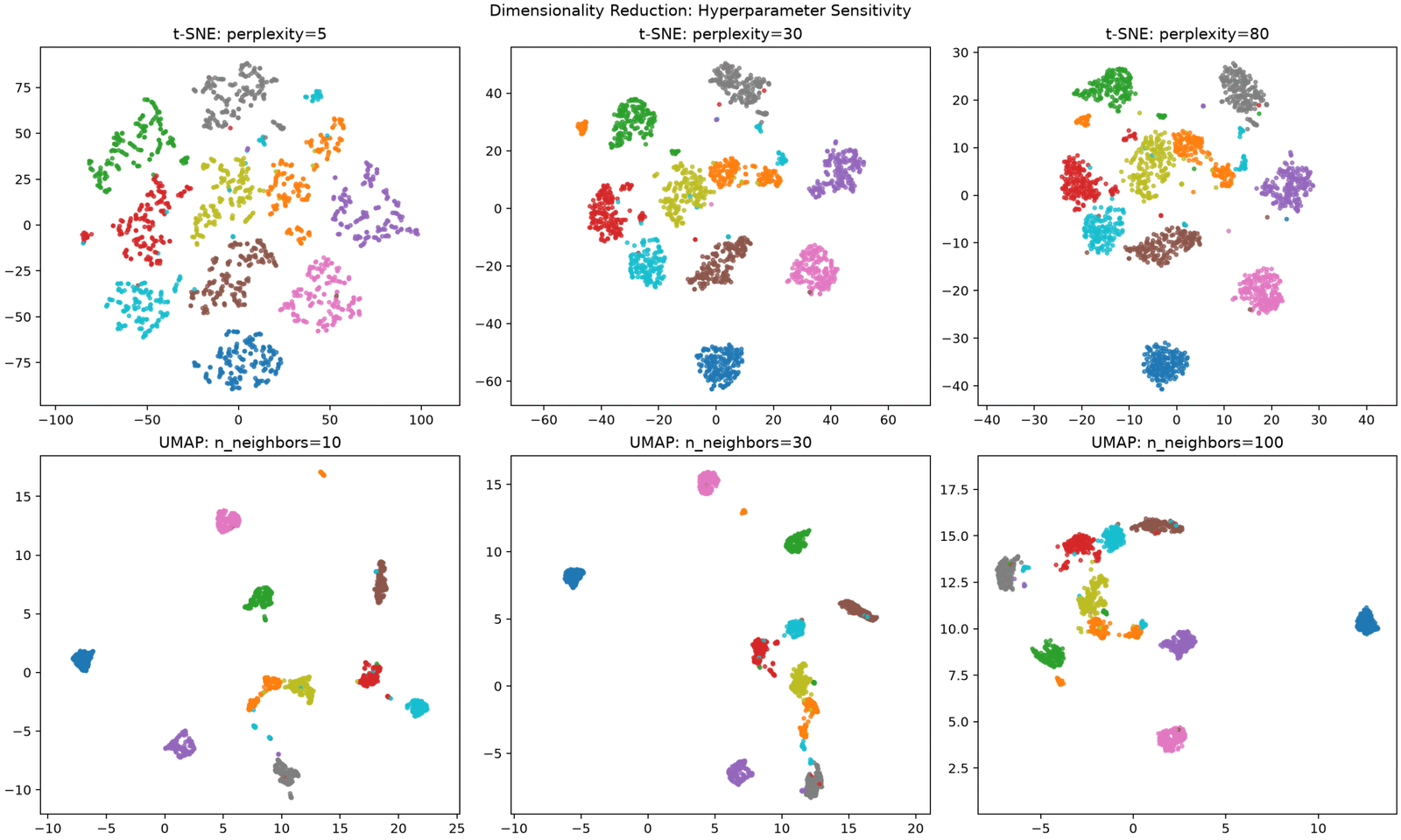
What to look for in the t-SNE results
At perplexity 5, the algorithm emphasizes very local similarities.
You may see:
-
Small fragments breaking away from larger groups.
-
More fine-grained structure.
-
Greater sensitivity to isolated observations.
At perplexity 30, the neighborhood scale becomes broader.
Groups may appear more coherent, although that is not guaranteed.
At perplexity 80, the algorithm considers broader similarity relationships.
Some small substructures may become less visible, and the overall arrangement may change.
Do not interpret movement of entire islands as evidence that relationships in the original data have changed.
Only the optimization settings changed.
What to look for in the UMAP results
With a neighborhood size of 10, UMAP emphasizes local structure.
Groups may look compact or fragmented.
With a neighborhood size of 30, local detail is balanced against somewhat broader connections.
With a neighborhood size of 100, broader neighborhood relationships receive more emphasis.
Some groups may become more connected or less sharply separated.
These observations are tendencies rather than deterministic rules. Actual behavior depends on the distribution and metric.
An additional experiment: vary minimum distance
After exploring neighborhood size, rerun UMAP with the neighborhood count fixed at 30 and test minimum-distance values of 0.0, 0.1, and 0.5.
This isolates the effect of point packing.
A smaller minimum distance can make groups look more concentrated without adding any new information about class membership.
That is a powerful warning against judging embeddings by visual compactness alone.
9. The cherry on the cake: t-SNE can make a widely dispersed cluster look as compact as a dense one
Here is one of the most surprising facts about dimensionality reduction.
t-SNE can transform two clusters with dramatically different spreads into clusters that occupy approximately the same area on a 2D plot.
This is not merely an occasional numerical failure.
It follows from the way t-SNE constructs locally adapted similarity probabilities.
Why it happens
Suppose we have two Gaussian groups:
-
Group A contains 250 points packed very tightly together.
-
Group B contains 250 points spread over a much larger region.
Both contain the same number of observations, but their original densities are very different.
t-SNE adjusts neighborhood scales locally when constructing high-dimensional similarity probabilities.
The dense group has a smaller local distance scale.
The dispersed group has a larger local distance scale.
When t-SNE tries to reproduce those neighborhood probabilities in two dimensions, the dense group can expand and the dispersed group can contract.
Consequently, both groups may end up occupying surprisingly similar areas.
This phenomenon was demonstrated memorably by Martin Wattenberg, Fernanda Viégas, and Ian Johnson in the article How to Use t-SNE Effectively.
Their experiments also showed that distances between well-separated clusters can be misleading and that certain hyperparameter settings can make unstructured data appear to contain convincing groups.
Reproduce the effect yourself
Create a script named cluster_illusion.py.
import matplotlib
matplotlib.use("Agg")

import matplotlib.pyplot as plt
import numpy as np

from sklearn.manifold import TSNE


rng = np.random.default_rng(42)

# A tightly concentrated group.
dense = rng.normal(
    loc=(-12.0, 0.0),
    scale=0.2,
    size=(250, 2),
)

# A much more dispersed group.
diffuse = rng.normal(
    loc=(12.0, 0.0),
    scale=2.0,
    size=(250, 2),
)

X = np.vstack([dense, diffuse])

labels = np.concatenate([
    np.zeros(250, dtype=int),
    np.ones(250, dtype=int),
])

model = TSNE(
    n_components=2,
    perplexity=30,
    learning_rate="auto",
    init="random",
    max_iter=1000,
    random_state=42,
)

embedded = model.fit_transform(X)


def rms_radius(points):
    center = points.mean(axis=0)
    distances_squared = np.sum(
        (points - center) ** 2,
        axis=1,
    )
    return np.sqrt(np.mean(distances_squared))


def spread_ratio(coordinates):
    radius_dense = rms_radius(coordinates[labels == 0])
    radius_diffuse = rms_radius(coordinates[labels == 1])
    return radius_diffuse / radius_dense


print(
    "Original spread ratio:",
    f"{spread_ratio(X):.2f}",
)

print(
    "Embedded spread ratio:",
    f"{spread_ratio(embedded):.2f}",
)

fig, axes = plt.subplots(
    1,
    2,
    figsize=(11, 5),
    layout="constrained",
)

for ax, coordinates, title in zip(
    axes,
    [X, embedded],
    ["Original 2D data", "t-SNE embedding"],
):
    for group, color, name in [
        (0, "tab:blue", "Dense"),
        (1, "tab:orange", "Diffuse"),
    ]:
        subset = coordinates[labels == group]

        ax.scatter(
            subset[:, 0],
            subset[:, 1],
            s=12,
            alpha=0.7,
            color=color,
            label=name,
        )

    ax.set_title(title)
    ax.set_aspect("equal", adjustable="datalim")
    ax.legend()

fig.savefig(
    "tsne_cluster_illusion.png",
    dpi=180,
)

plt.close(fig)
Run:
python cluster_illusion.py
The script displays the original data and the t-SNE embedding side by side.
It also measures the relative group spread before and after embedding.
In the original data, the second group’s standard deviation is ten times larger along each coordinate.
After t-SNE, the apparent spread ratio can shrink dramatically. In our run the script printed Original spread ratio: 10.61 and Embedded spread ratio: 1.07 — a tenfold difference in spread became almost none.
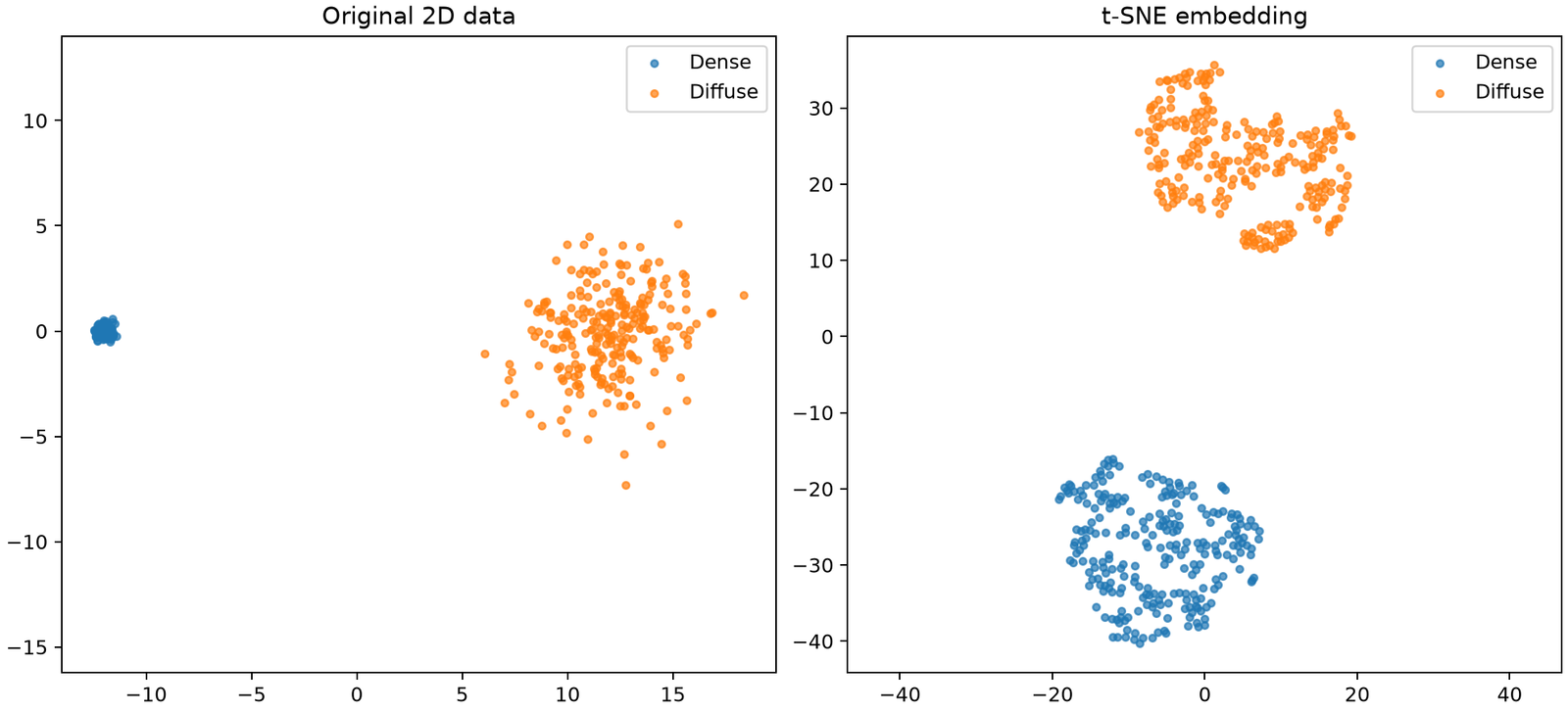
The precise result depends on initialization, optimization, and hyperparameters, so it is important to inspect the actual measured ratios rather than assume a fixed result.
The deeper lesson
A t-SNE visualization is not a geographical map.
You cannot safely interpret it as though all plotted lengths, distances, and areas shared the same meaning as their high-dimensional counterparts.
In particular:
-
A bigger-looking cluster is not necessarily more variable.
-
A tightly packed cluster is not necessarily denser in the original feature space.
-
A larger gap does not necessarily imply greater dissimilarity.
-
A clean island boundary does not prove a statistically distinct population.
UMAP can also distort densities and geometric relationships, although its mechanisms differ.
If preserving local density matters, UMAP’s ecosystem includes a density-aware extension called densMAP. Even then, interpretation requires validation against the original data.
The safest strategy is to examine interesting observations back in their original feature space before concluding that a visual pattern represents a meaningful discovery.
10. Choosing the right algorithm in practice
There is no universal winner.
A better selection strategy begins with the task.
Scenario A: You need a fast exploratory baseline
Choose PCA.
It is particularly effective for:
-
Inspecting broad sources of numerical variation.
-
Identifying redundant directions.
-
Creating reusable features.
-
Establishing a baseline before applying nonlinear methods.
Because its principal directions are defined in terms of the original features, it is also much easier to interpret.
However, PCA’s two-dimensional visualization should not be mistaken for a complete picture when much of the variance lies outside those first two components.
Scenario B: You want to explore local relationships in learned embeddings
Try t-SNE.
Typical examples include examining whether neural network representations organize images or documents into local groups.
Use it when the primary question concerns neighborhoods rather than distances between separated islands.
For reliable interpretation, compare multiple perplexities and random seeds.
If important conclusions disappear under reasonable parameter changes, treat them as exploratory hypotheses rather than established findings.
Scenario C: You need a reusable nonlinear embedding
Consider UMAP.
It provides a practical combination of nonlinear neighborhood learning and support for transforming new data.
It is often attractive for larger datasets, although actual speed depends on sample count, feature count, approximate-neighbor construction, hardware, and settings.
Benchmark against your own data rather than assuming that one implementation is always faster.
Scenario D: You are preparing features for a predictive model
Be cautious about reducing dimensions to two.
A 2D visualization is optimized for human inspection, not necessarily predictive performance.
A classifier or regression model may benefit from 10, 30, or 100 retained dimensions instead.
PCA is a natural baseline for this use case.
UMAP may also be worth evaluating when nonlinear structure appears important.
Use cross-validation and fit all preprocessing and dimensionality reduction operations only on the training portion of each fold.
Otherwise, information from held-out observations can influence the learned representation and bias the evaluation.
Scenario E: You have sparse, high-dimensional text data
Sparse text vectors introduce another consideration.
Ordinary PCA centers its inputs, which can be inefficient or inappropriate for very large sparse matrices.
Truncated SVD is often a better first-stage reduction method for sparse document-term or TF-IDF matrices because it can operate without centering the data.
A practical workflow may be:
-
Convert documents into an appropriate vector representation.
-
Apply truncated SVD when working with high-dimensional sparse vectors.
-
Compare neighborhood-based 2D visualizations using the reduced representation.
-
Validate neighborhood preservation against the input representation that defines the task.
When comparing algorithms, document exactly which representation each received.
11. Common mistakes that invalidate dimensionality reduction analyses
Even technically correct code can produce misleading conclusions.
These are the errors worth looking for during code reviews and exploratory analysis.
Mistake 1: Using different preprocessing for each algorithm
Suppose PCA receives raw features while UMAP receives standardized features.
Differences between their visualizations may then result from preprocessing rather than dimensionality reduction.
For a fair experimental comparison, use the same observations, feature representation, and appropriate preprocessing baseline.
You can certainly compare preprocessing strategies, but treat that as a separate experiment.
Mistake 2: Clustering the 2D plot and treating the result as ground truth
Clustering a nonlinear visualization can seem tempting.
After all, visually separated groups are easy to identify.
But the reduction may have distorted global distances, local densities, or connectivity.
Consequently, clustering the embedded coordinates can identify structures introduced or amplified by the visualization itself.
A better default is to run clustering on an appropriate original or higher-dimensional representation, then color the 2D plot using those cluster assignments.
That makes the visualization an exploratory diagnostic rather than the source of the labels.
Mistake 3: Forgetting stochasticity
Different seeds can yield different nonlinear embeddings.
A fixed seed helps with repeatability, but it is not a universal guarantee of identical results across platforms, software versions, and execution configurations.
UMAP’s documentation specifically notes that multithreaded optimization introduces race conditions that can affect reproducibility. Setting a random seed can constrain its execution to support reproducible results, potentially affecting speed.
For an important analysis, save the fitted configuration, package versions, and resulting coordinates.
Mistake 4: Comparing absolute axis coordinates
Rotations, reflections, translations, and changes in scale can alter an embedding’s visual coordinates without fundamentally changing its neighborhood structure.
Do not assign physical meaning to t-SNE or UMAP axis values.
Likewise, do not treat a point moving from the left side to the right side between two independently fitted maps as evidence of a meaningful change in the observation.
Mistake 5: Using only a single evaluation score
Trustworthiness is useful, but insufficient.
For a high-stakes interpretation, investigate local neighborhoods, broader relationships, sampling effects, and domain-specific evidence.
An embedding can preserve nearby neighbors exceptionally well while being unsuitable for comparisons between distant groups.
Mistake 6: Forgetting sampling bias
If you visualize only a subset of a large dataset, that subset determines the graph or probability structure the algorithm sees.
A sample containing too few rare observations may hide minority patterns.
A heavily stratified sample can overrepresent rare groups and make them appear more prevalent than they are.
Sampling should match your analytical question.
If you intentionally balance categories, disclose that fact and avoid interpreting visual group sizes as real population proportions.
12. A practical validation workflow for serious projects
For production analytics or research, use a disciplined process rather than choosing the prettiest visualization.
A useful workflow has six phases.
Phase 1: Define similarity.
Decide what it means for two observations to be close.
For normalized numerical features, Euclidean distance might be reasonable.
For some text or semantic embeddings, cosine distance may align better with the underlying meaning.
For mixed numerical and categorical features, additional preprocessing or a different similarity construction may be required.
Phase 2: Inspect feature quality.
Check missing values, scales, outliers, duplicate observations, near-constant features, and highly redundant measurements.
Dimensionality reduction does not automatically repair poor feature engineering.
Phase 3: Establish PCA as a baseline.
Inspect the first two principal components and explained variance ratios.
If PCA already provides an informative view, a nonlinear embedding might not add enough value to justify its complexity.
Phase 4: Explore nonlinear alternatives.
Run several t-SNE and UMAP configurations.
Change one hyperparameter at a time whenever possible.
Use the same observations and input representation for every comparison.
Phase 5: Quantify stability and neighborhood quality.
Compute trustworthiness or neighborhood recall at several neighborhood sizes.
Compare multiple random seeds.
Inspect important point pairs back in the original input space.
For large datasets, evaluate expensive diagnostics on representative, reproducibly selected samples.
Phase 6: Separate observation from explanation.
A plot can suggest that two product groups differ.
It cannot, on its own, tell you why they differ.
Investigate the original features, metadata, and relevant external validation before forming conclusions.
This distinction between exploratory evidence and validated explanation is central to responsible dimensionality reduction.
13. Final comparison: what should you trust?
The most useful way to compare these techniques is to ask what each one gives you permission to conclude.
| Question | PCA | t-SNE | UMAP |
|---|---|---|---|
| Which linear directions explain variance? | Strong choice | Not suitable | Not suitable |
| Are these observations local neighbors? | Sometimes | Main strength | Main strength |
| Are two distant groups exactly this far apart? | Only for represented linear geometry | Not reliable | Not guaranteed |
| Does cluster area reflect original variability? | Only partially, for projected variance | Not reliable | Not generally reliable |
| Can I map new observations without refitting? | Yes | Not with standard scikit-learn t-SNE | Yes, approximately |
| Can I inspect feature contributions directly? | Yes | Not directly | Not directly |
| Can I trust one attractive plot? | No | No | No |
A practical default is:
-
Begin with PCA to understand the dominant linear structure.
-
Use t-SNE to investigate local neighborhoods when visualization is the main goal.
-
Use UMAP when nonlinear structure and a reusable transformation matter.
-
Validate every method against the original feature space and your actual analytical objective.
The most important lesson is that a two-dimensional embedding is a representation of selected relationships, not a complete reconstruction of high-dimensional reality.
A clear visualization can be useful without being geometrically faithful.
A messy visualization can expose genuine ambiguity that a cleaner one conceals.
And a visually perfect separation can sometimes be an artifact of the algorithm’s objective.
14. Your next experiment
You now have a complete project for comparing three major dimensionality reduction techniques, evaluating neighborhood preservation, testing hyperparameter sensitivity, and reproducing one of the most misleading behaviors of t-SNE.
Here’s a challenge that will deepen your understanding:
-
Run the side-by-side comparison on the handwritten digits dataset.
-
Repeat t-SNE with three different perplexities and UMAP with three different neighborhood sizes.
-
Compare trustworthiness at neighborhood counts of 5, 10, and 30.
-
Identify two observations that look close in one embedding but far apart in another.
-
Examine their original 64-dimensional vectors and determine which view better reflects the similarity you care about.
For an extra challenge, repeat the workflow with your own product, sensor, or text-embedding dataset.
Don’t aim for the prettiest scatter plot. Aim for a visualization whose limitations you understand and whose important relationships you can verify.
That is the difference between merely plotting high-dimensional data and actually learning something from it.